
5 Tips when considering typography

Rach Brind-Surch
31st July 2018
Typography is the art of arranging type and dates back to when text was laid out with spacing and lettering on a printing press by hand to create the final form. It is an area of design that is often overlooked and underestimated. It should be an integral part of any brand, ensuring consistency and creating a tone that reflects the character of the organisation or product.
This quick guide is going to touch on some of the key elements within typography, to give you a better understanding of type and how to use it well.
1. Learn the correct terminology
Whether you are creating a piece of work yourself or collaborating with a designer, it’s always helpful to be using the same language to describe the work. It gets you on the same wavelength and able to discuss ideas to create a better end solution. There are specific terms that relate to the various parts of each letter as well as the size and space relationships within a typeface.
There are many guides online such as Typedecon which provides a really helpful glossary of terms so you can learn the anatomy of typography and what the various elements within a typeface are referred to.
Helpful key terms you may need to know for this article are:
Character: Individual symbol, a set of which makes up a typeface, this can be a number, letter, or punctuation.
Glyph: A non-standard or decorative variation of a character.
Uppercase: The capital letters of the alphabet are uppercase glyphs.
Lowercase: The non-capital letters of the alphabet are lowercase glyphs.
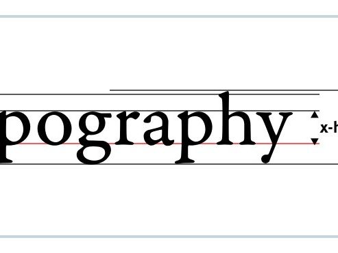
Body Height: The distance between the top of the tallest letterform to the bottom of the lowest one.
Baseline: The imaginary line upon which a line of text rests.
X-height: The distance between the baseline of a line of type and the tops of the main body of lower case letters, not including descenders or ascenders.
Stem: The main (usually) vertical stroke of a letterform.
Ascender: The upward vertical stem on some lowercase letters, such as h and b. The imaginary line that these reach is called the Ascender Line. This line can be different to the Cap Line which differs in that it shows where all the Uppercase Characters reach to.
Descender: The downward vertical stem on some lowercase letters, such as p and y. The imaginary line that these reach is called the Descender Line.
Serif: A little extra stroke found at the end of main strokes of some letterforms.
Italics: Italic typefaces slant to the right and are paired with a regular font, generally used for a some kind of emphasis with in a body of text or caption. A true italic is individually designed to match the regular font from scratch rather than merely tilting the regular font.
Kerning: The space between two letters.
Tracking: The space between all the letters in a word.
Leading: The space in between lines of text.
Weight: This describes how fat or thin the strokes of a font are, with the most common weights being regular or bold. Some fonts may provide a myriad of weights from extra light to extra black.
2. Know your font classifications
Type classification is almost like a genre of film. It suggests that the type will have certain attributes shared by others in that classification. It is good to know some of the basic areas so you can accurately describe the kind of look of a font you may wish to use. The two main classifications you will often see referenced in the names of typefaces are serif and sans-serif but there are others that it is worth knowing about too.
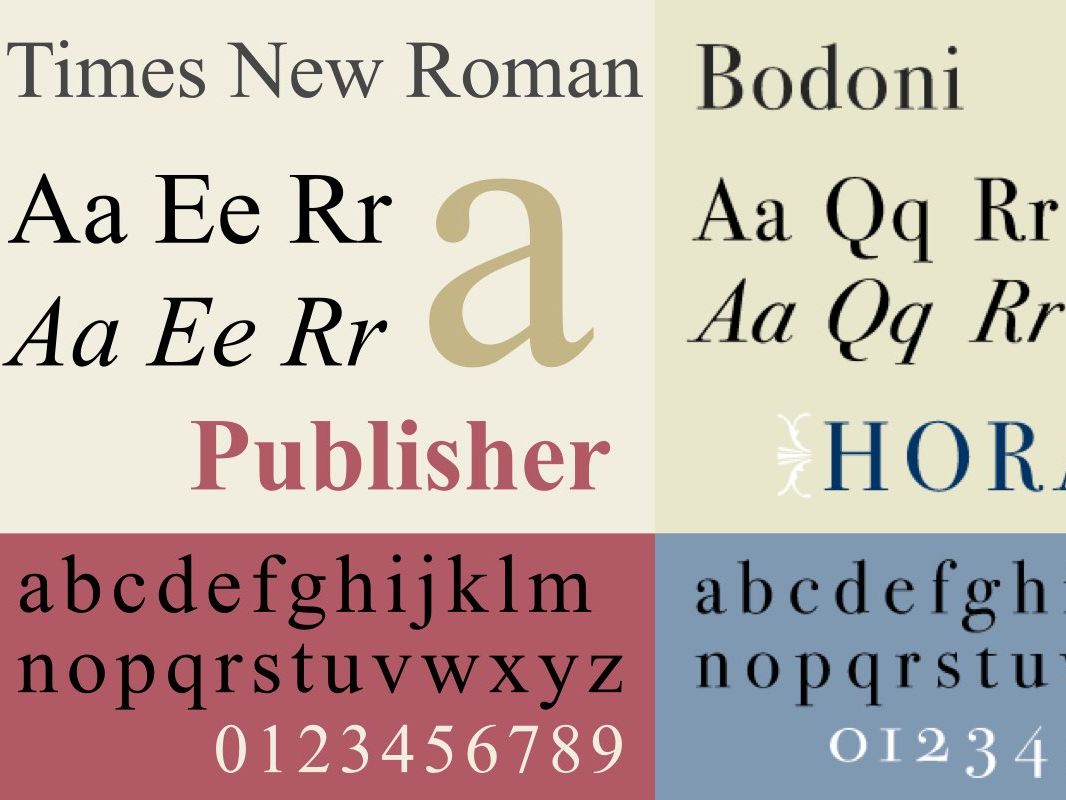
Serif fonts are simply fonts that contain serifs, (as described in the list of terms above). Serifs create a greater level of distinction between the letters and so serif fonts have traditionally been used in print work for its legibility. Probably the most famous example of the serif font is is Times New Roman.
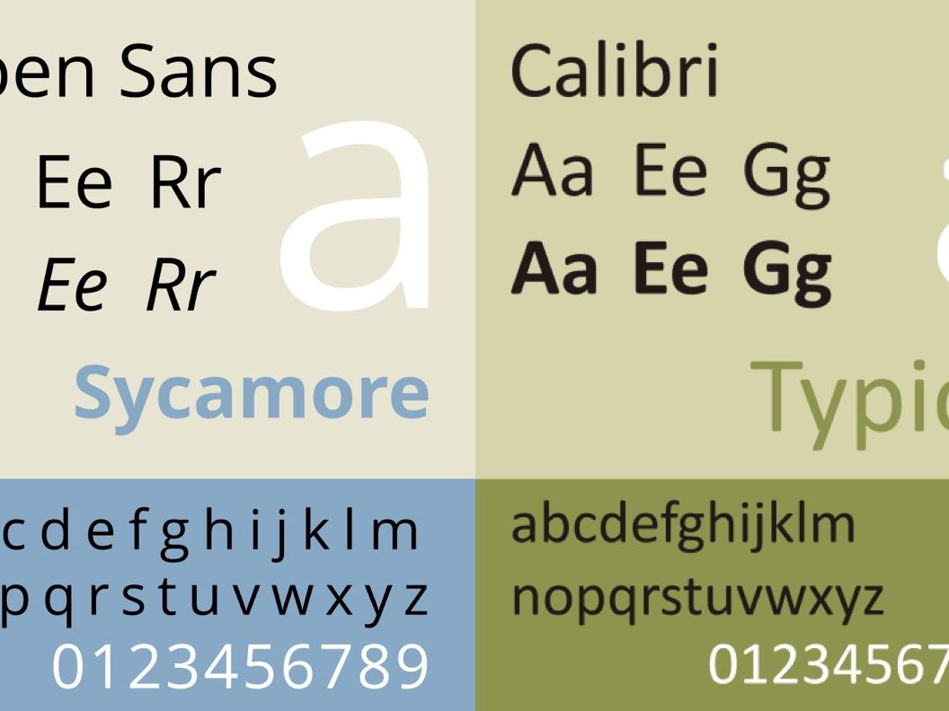
Sans means ‘without’ in French, which is why sans-serif simply describes a font without serifs. Sans-serif fonts are typically considered to look more modern and provide good readability even on low resolution screens. For this reason they are commonly used in blog posts and on websites. However as screen resolution continues to improve there is some reverting back to serif fonts, reflecting traditionally print design conventions moving over onto web platforms. A well known example of this font is Arial or Calibri.
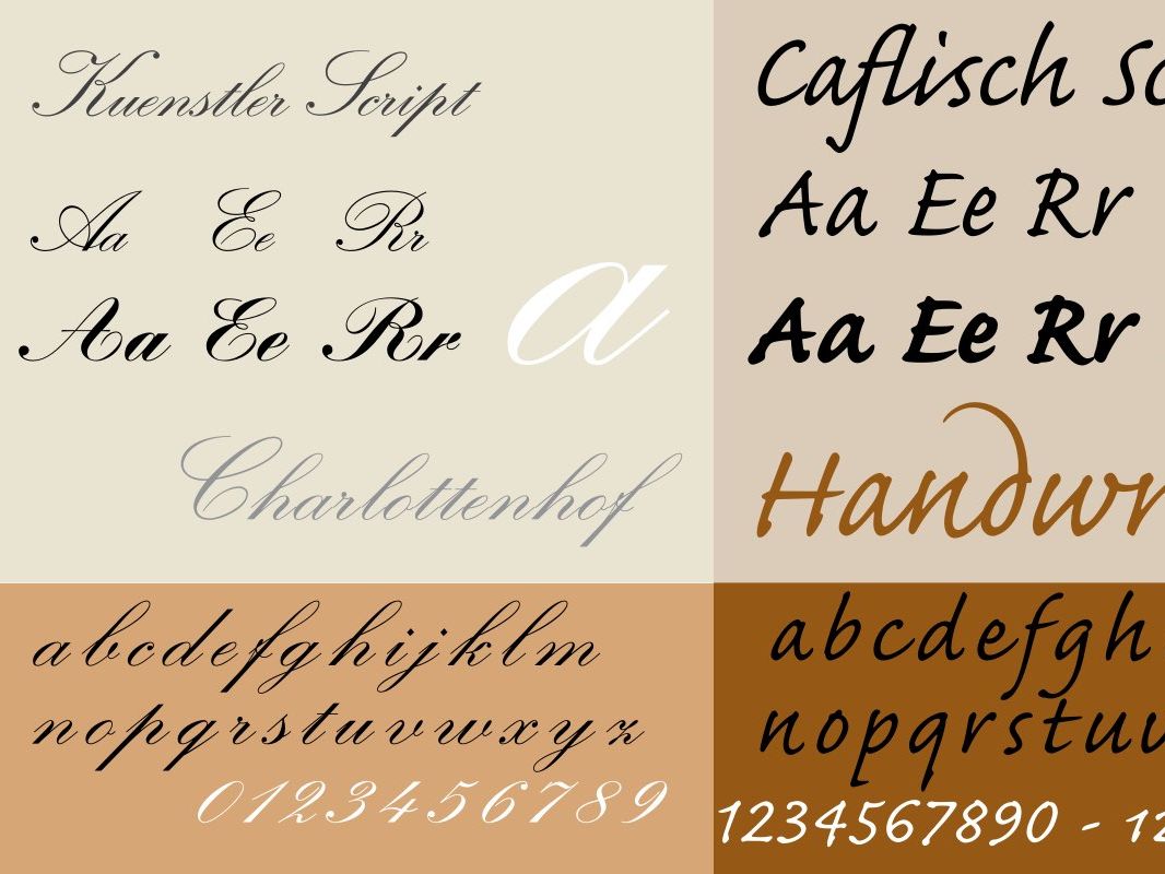
Script typefaces vary widely and mirror handwriting in a range of styles, most commonly formal or casual. Formal script typefaces take elements from calligraphy, and often contain graceful loops and flourishes. For this reason they are not used for large quantities of text and instead used as headings or accents on formal invitations, awards or diplomas. Casual script typefaces are less formal and look more like your average handwriting. This can create a more friendly or accessible tone and generally involves fewer flourishes.
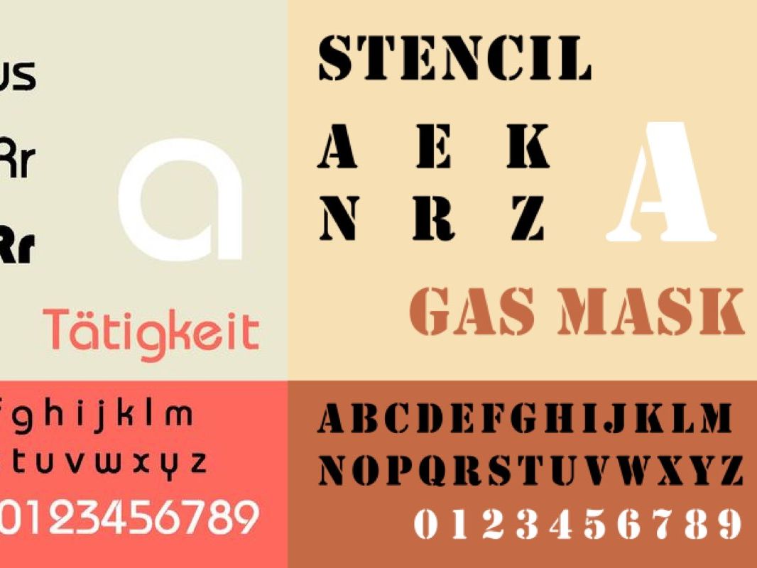
Decorative typefaces are more miscellaneous and artistic. It is an incredibly broad category which encompasses typefaces that are largely used for display purposes and as such are distinctive and unique. They can defy any or all of the conventions of normal typography in order to do this and as such make poor candidates for use at smaller sizes.
3. Use type families
Often when implementing a design or developing a brand, a designer may use more then one typeface, however that is not always necessary.
A typeface family is a whole range of fonts that are all based on one root typeface.
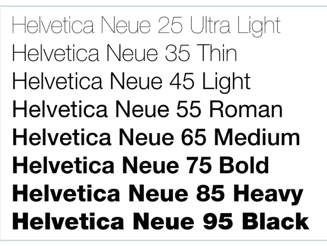
The variations can range from extra light to extra bold alongside spacing and italic options. Using one type family in a number of different weights, creates a consistent uniformity in your design whilst allowing enough diversity to create a sense of hierarchy. Which leads us nicely onto..
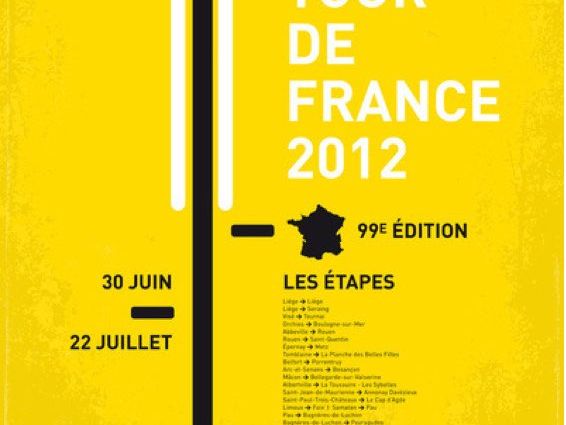
4. Use hierarchy
Good typography can be used as a directional tool to show what text elements in your design are most important. Colour, weight, size and position of a text can work to direct the eye around your design. Creating a simple hierarchy adds to the sophistication to your design and will give your user a clearer and more helpful experience.
For example, your header or tagline may well be found near the top of the space, in a bigger, bolder typeface, whilst a picture caption is usually smaller, thinner and can be italicised.
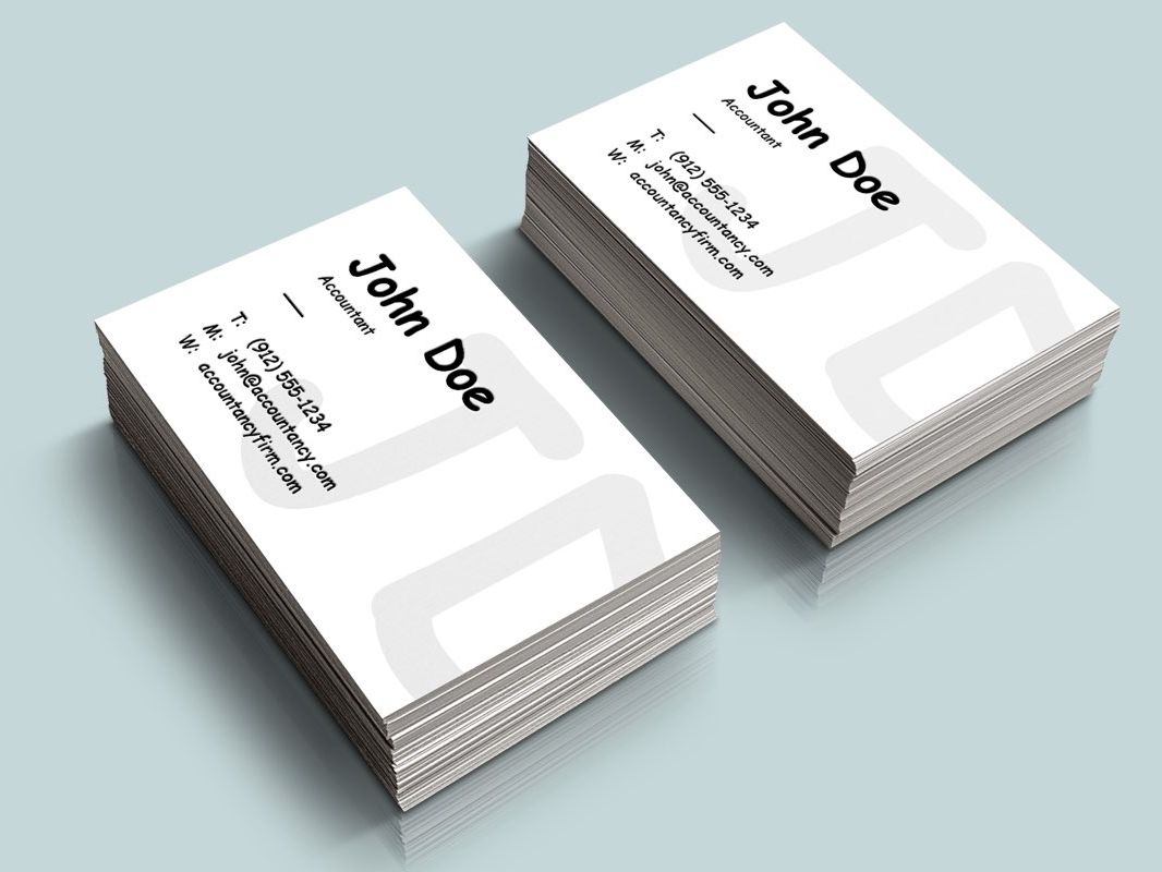
5. Consider the context
When selecting a typeface it is always important to consider the context of where it is being set. This has implications for sizing, legibility, and tone. A formal script font, for example, will not be suitable on a piece of a design for a young child who may have only just learnt to read, whilst Comic Sans is not advisable on your newly printed business cards for your accountancy firm.
Always consider where and how this piece of design will be viewed and by who.

Like what you see and ready to start?
Let's talk!
The easiest way is to select an open space in our calendar for a discovery call at your earliest convenience.
Book a call
We work with clients of various sizes and across a wide range of sectors. We provide the following services:
Digital Marketing
Digital marketing solutions driven by results, designed to enhance your online presence and engagement, fuelling business growth.
PPC SEO Email Marketing Marketing for Charities Social Media
Websites
Efficient web-based systems, leveraging database-driven digital products to streamline operations and enhance user engagement.
Marketing Ecommerce Websites for Charities Bespoke Web Applications