
7 Reasons to Rebrand: Part 3

Rach Brind-Surch
15th May 2019
In the final instalment of this series we are going to focus on changes which could be putting pressure on businesses either external through poor public perception or internally through messy or inconsistent guidelines and practices. We are going to look at how rebranding a company can achieve better outcomes in the face of these challenges.
Escaping a Negative Image
The old adage of their being no such thing as bad publicity is unfortunately not necessarily true and a strong, easily identifiable brand can become a burden when memorable for all the wrong reasons. When bad publicity and notoriety begin to affect a company or organisation's ability to make a profit or operate effectively, it may be time they consider a rebrand. This can help to dilute the negative associations or dispel bad feeling
The most successful changes in these cases go way beyond the exterior visual images but also go to show change in the organisation. It gives the message that real change has been made and old practices have been rectified. This is the only way that a rebrand project can remove any negative associations with the brand and therefore be successful as anything less can feel tokenism or disingenuous.
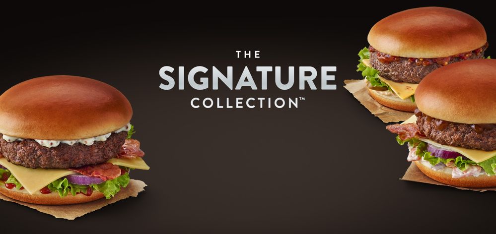
An ongoing example where this can be seen is Mcdonalds.
Whilst the golden arches of the fast food chain have not changed in any significant way they have had to combat the negative brand image cultivated throughout the1990s and early 2000s. Previously marketed as a reliable, friendly fast food provider for families it began to be seen as a source of cheap, nasty food. Documentaries like Supersize me and press around the poor quality ingredients painted Mcdonalds as the implementers of the obesity crisis hitting the western world and dug into their profit margins.
Mcdonalds has since fought back with a more nuanced fresh brand image. Whilst the logo remains the same physical restaurants have been overhauled to modernise them and create a more clean, upmarket feel when compared to similar fast food franchises. They have also introduced healthier food options whilst emphasising the origins of its ingredients in marketing materials. The brand is shown to be recovering well, with minimal changes to its overarching logo and basic visual identity.
Developing a Cohesive Corporate Identity
This particular reason for a rebrand has a lot of crossover with many of the previously mentioned factors. Indeed it may be that attempts to cater for these other areas of concern in the business lead to problems in this area. As a company grows and the new challenges arise, brand guidelines can end up growing organically, out of necessity rather than strategy.
Most organisations may start small with a corporate identity consisting of a simple logo, primary colour palette and typography. More advanced elements such as visual language, photography styles and tone of voice go undefined. Clumsy applications of these logos, typefaces and colours don’t always give the best impression and can wind up resulting in some pretty poor thought out offerings, which don’t always show the brand at its best. It can also result in compromising some previously laid out rule or taking creative freedom in the absence of clear detailed guidelines.
The overall outcome is a messy identity and inconsistent visuals across the entire spectrum of the business overseen by an unwieldy set of brand guidelines that don’t always make much sense and aren’t fit for purpose.
Taking stock of where you have got to and what elements should be kept versus what should be let go of is sometimes necessary. Shedding a lot of branding dead weight can result in sleek set of guidelines with simpler, more effective applications and a clearer more concise corporate identity.
A good example of this can be seen in the successful rebrand of the high street cosmetic brand Lush, in moving online they addressed their brand and made subtle changes to consolidate their brand into a flexible black and white word mark, which linked to their POS and Packaging in brick and mortar stores and gave a strong graphic look in which to showcase the bright colours and textures of their home made products. Though they have not fully retired their old yellow and green logo it is now found mostly on packaging - which fits with their stance on packaging and single use plastic.

All of the challenges and changes addressed in this and the previous articles can be overcome with the right attitude and strategy and we would love to provide that service to you. Our team can bring a fresh insights and a new approach to your business in order to evaluate where your brand is currently and if it is working for you well or could do with some improvement.
If you think that you would like to explore your brand with us then please do get in touch.
Like what you see and ready to start?
Let's talk!
The easiest way is to select an open space in our calendar for a discovery call at your earliest convenience.
Book a call
We work with clients of various sizes and across a wide range of sectors. We provide the following services:
Digital Marketing
Digital marketing solutions driven by results, designed to enhance your online presence and engagement, fuelling business growth.
PPC SEO Email Marketing Marketing for Charities Social Media
Websites
Efficient web-based systems, leveraging database-driven digital products to streamline operations and enhance user engagement.
Marketing Ecommerce Websites for Charities Bespoke Web Applications