Rebrand for Formula One

Rach Brind-Surch
4th December 2017
Now I will hold my hands up and say that Formula 1 is not a sport I embrace. Formula 1 for me is the happy memory of sitting down on a Sunday afternoon to watch the grand prix whilst my Grandad snoozed away a roast dinner, and not a lot more.
However I do have opinions on branding and logo design and the outcry of fans after the new logo announcement for Formula 1 this weekend was hard to ignore. One survey showed that three quarters of fans were most definitely not a fan or the new offering from Richard Turley’s team, at Wieden + Kennedy London (The guys that came up with threes moon walking Pony and THAT Honda advert).

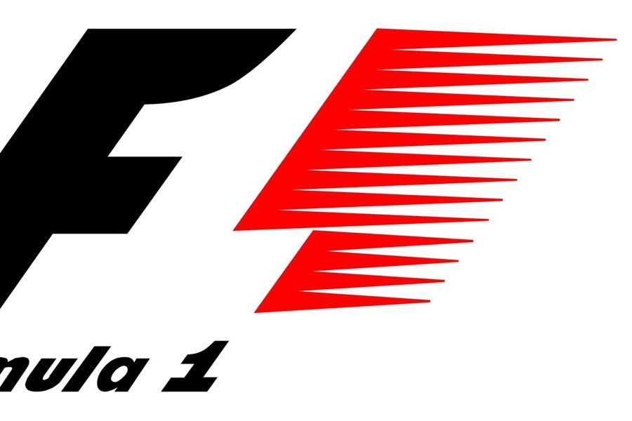
It has been 23 years since anybody dare tamper with the iconic Formula 1 logo. It’s use of negative space to create the 1 was innovative. It makes the observer feel a little glow of satisfaction when they first work out that sharp little piece of design. Sometimes on their first viewing, sometimes on their fiftieth. This cleverness though is allegedly part of the problem. One of the reasons given for the new design, besides the ever present and obvious need to ‘simplify for digital’ is that for some, the elusive 1 just did not read!
But is the new logo any better? Any drastic change to the familiar is bound to provoke an outcry of some description. Is the new logo as bad as the reaction though?

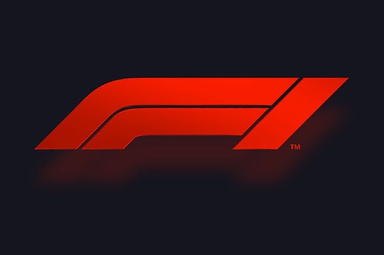
The change is indeed pretty drastic. The figure of an F and simplified 1 are formed from 3 bold streaks of red. The ‘modern-retro feel’ is said to be inspired by two cars battling for pole position as they turn the final bend to the finishing line.
Did you see it? No, me neither.
Whilst the low flat lines leaning forward succeed in connoting the speed and shape of the impressive machines which eat up the track, they do not succeed in denoting the numeral 1 particularly clearly. One of the criticisms levied at the new logo is that it in fact suggest FI rather than F1. If they did indeed feel they wanted a clearer alternative to the negative space 1 of previous years, it might be time to head back to the drawing board.
Nevertheless this new logo is not the disaster some would have you believe. The blocky nature of it, clearly lends itself to animation and digital. It can be elastic, built from any material, burnt into frame by rubber tread marks or smeared in engine oil. It can be scaled to fit tickets and souvenirs whilst stand loud and proud on a billboard with literally no detail lost because there is no detail to lose. It will happily sit along the barrage of logos in every area of the sport without appearing outdated, but will it stand out?
I’m not so sure. It does make me think that we designers have our work cut out for us as the trend for logo design pushes towards flat, bold and simple. How do we make our designs clever and distinguishable? How do we make them say what we want to say and evoke, clearly, what we want to evoke?
Of course brand is so much more than just the logo. It is the feel of the company, or organisation. It is the emotions consumers attach to it, and the experiences that go along with it. Understanding your brief is key, but your user is the ghost writer of your brief as it is their reaction which ultimately decides on the success of your offering. Perhaps with this redesign it is a miscommunication of these crucial things which have provoked the fans (and drivers) into such a backlash.
As Liberty Media step in to take the proverbial steering wheel it is easy to throw the baby out with the bath water. Perhaps instead of a whole new look there was a little bit of negative space for an iconic, well loved and sometimes overlooked 1 to be reimagined? Perhaps an upgrade rather than a brand new model may have been more fitting.

Like what you see and ready to start?
Let's talk!
The easiest way is to select an open space in our calendar for a discovery call at your earliest convenience.
Book a callWe work with clients of various sizes and across a wide range of sectors. We provide the following services:
Digital Marketing
Digital marketing solutions driven by results, designed to enhance your online presence and engagement, fuelling business growth.
PPC SEO Email Marketing Marketing for Charities Social Media
Websites
Efficient web-based systems, leveraging database-driven digital products to streamline operations and enhance user engagement.
Marketing Ecommerce Websites for Charities Bespoke Web Applications