
Rebrand for Uber: Travelling Light

Rach Brind-Surch
26th September 2018
Uber isn’t standing still, having only just had a rebrand in 2016, followed by some inescapably bad press, they are moving onwards and upwards with a complete overhaul of their brand and as a result their marketing materials at large.
The designer of the new brand guidelines are brand consultancy firm Wolff Olins have completed a set of friendly, consistent branding guidelines with wide-reaching application across a now global brand.
The new branding system incorporates nine different elements:
- Logo
- Composition
- Typography
- Iconography
- Colour
- Motion
- Photography
- Illustration
- Tone of Voice
Some feel more contrived than others.
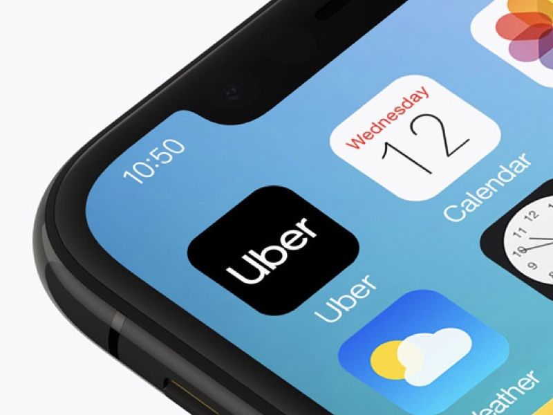
The logo has a strong focus on the company’s status as a household name which has passed the test of transitioning from noun to verb, much like hoover or google. As such any kind of graphic mark has been eschewed leaving the stark, black on white wordmark. The name is so short and the company can get away with this, however it's a bold choice for what is yet another minimal, sans serif logo.
The new logo therefore is obviously tied inextricably to the newly developed typography. It is overwhelmingly practical, incredibly legible at different sizes and easily translatable to different languages. Its conventions are incorporated into a travel-inspired set of icons which has plenty of applications across its multilingual marketing materials and in-app digital graphics.
Icon sets for an international company with a huge range of employees from a wide variety of backgrounds is essential. Uber now have both a filled and outlined set of clear, clean icons to give maximum flexibility in their usage. The arrow icon from the set seems to have been given particular significance. Plastered over Uber’s example poster ads, it indicates a company trying to move forward and not just in the literal sense of getting its users from A to B.
With the decision to utilise unfussy typography comes a relatively unfussy colour palette, largely keeping to black and white they have included a new ‘safety blue’, used to emphasise aspects in marketing materials which relate to Uber’s care and safety, also highlighting any key interactions with users. A broader muted colour palette is also available for use within Uber’s marketing illustrations.
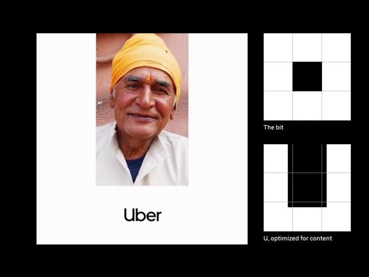
Arguably the new set of guidelines most of note, sometimes incredibly forcibly, is the composition structure which gives particular emphasis to the ‘U’ device. Here, sections of a square grid-like ‘U’ (already jarring to me against the curve of the word mark) are imposed on various design compositions so that they all show “a subtle ‘U’” except where the image has been framed in such a way that it, well, erm… doesn’t. (Come on Wolff Olins, that is quite clearly just a full bleed image - the ‘U’ is irrelevant).
When applied in advertising, particularly in the geographic poster ads, it creates an interesting, quirky layout that can have varying photographic textures and imagery applied and provide the strong, diverse visuals one would expect from a travel company. Considering this is achieved by simply losing the top margin, it’s pretty clever. The ‘U’ device also looks great when using footage and motion graphics.
One element that seems to have been slightly overlooked in the wake of the “U’ composition system” is the addition of some neat geometric illustrations. Drawing inspiration once again from the logo’s simplicity, the illustrations are paired back and feature the frequent use of white space which, as an illustrator I rather enjoyed, especially their inclusion on the clean white printed pages of the the driver's manual. However, I then saw them employed on Uber’s website and was slightly confused by the addition of a grey background. Such a great shame.
Overall it’s a positive, more personable step for Uber, if a bit boring.
Like what you see and ready to start?
Let's talk!
The easiest way is to select an open space in our calendar for a discovery call at your earliest convenience.
Book a call
We work with clients of various sizes and across a wide range of sectors. We provide the following services:
Digital Marketing
Digital marketing solutions driven by results, designed to enhance your online presence and engagement, fuelling business growth.
PPC SEO Email Marketing Marketing for Charities Social Media
Websites
Efficient web-based systems, leveraging database-driven digital products to streamline operations and enhance user engagement.
Marketing Ecommerce Websites for Charities Bespoke Web Applications