
 Fusion
A Custom Card Deck Design for Fusion
Overview
Fusion works with students who belong to the Christian faith and community. It helps to encourage them to live out their faith practically at university and share it with their fellow students. They provide students with resources and equip them so they can engage others in their faith and grow personally.
A revisit and refresh
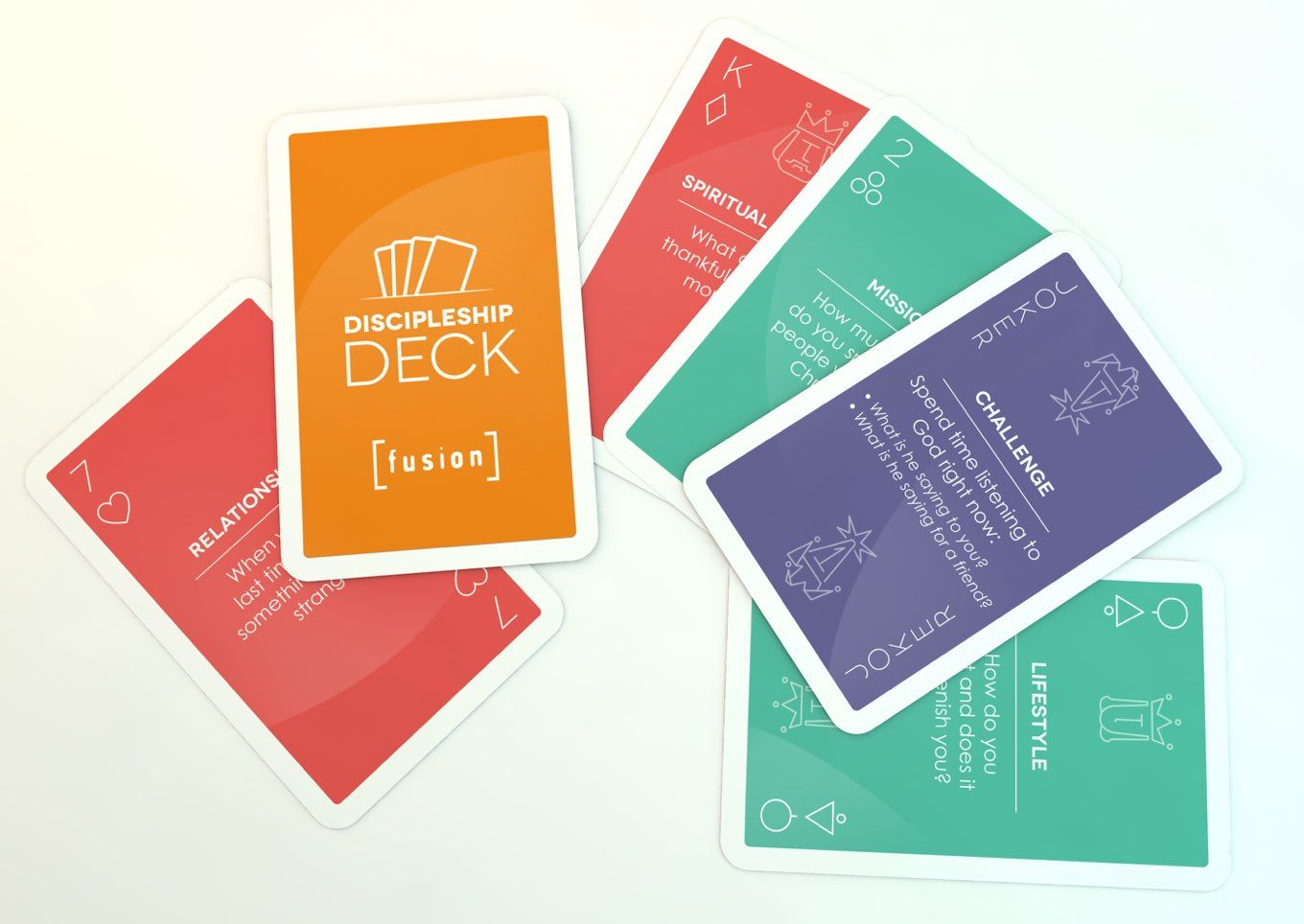
Previously we were asked to design artwork for a deck of playing cards with a twist - They were a fun tool to help ask students searching questions, to get them to think about where they were at and where they wanted to be. They proved so popular that the Fusion team came back to us for help designing another version of the tool: The Deep Meaningful Conversations (DMC) Deck.
The previous deck of cards was a tool for individual Christian Unions to use to help those already with some knowledge or interest in the Christian faith. The DMC Deck is intended to be used more casually with friends for normal games and also as conversation prompts to get people thinking about their lives, relationships and goals in greater depth.
This meant Fusion wanted the cards to look more like a traditional card deck than the Discipleship Deck whilst maintaining the clean uncluttered style that highlighted the questions on each card.
Our approach
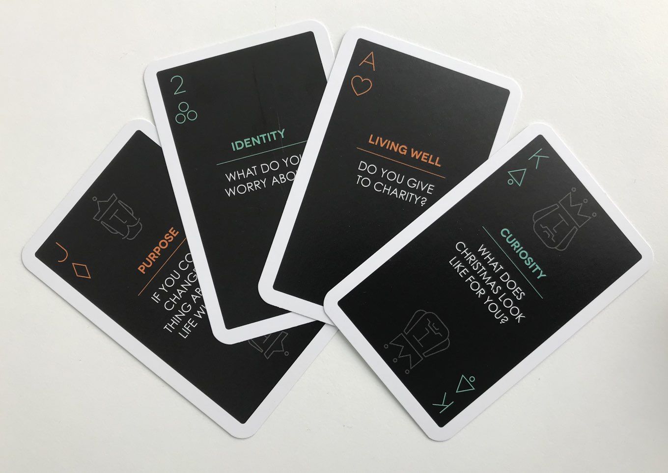
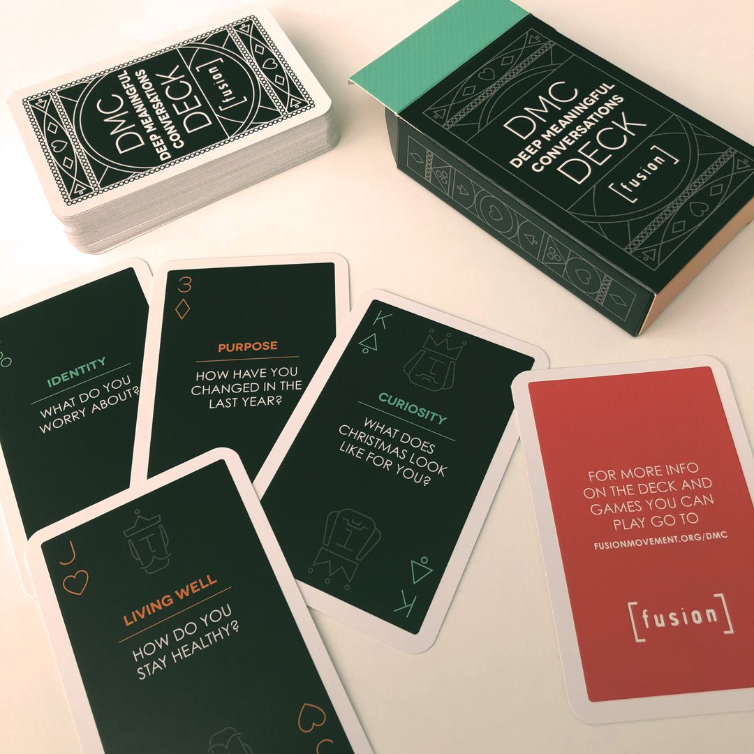
In order to maintain some cohesion between the two decks we wanted to include the same minimal suite and picture card icons design. This gave us a clear launch pad for the DCM deck.
The original deck was quite bright, utilising the distinctive Fusion orange and a number of other secondary brand colours. For this more relaxed deck we felt a more muted palette with pops of the bright colours would tie in with the chilled evening conversations that Fusion hopes this deck will provoke.
The limited palette was then paired with a clean geometric pattern, which utilised some of the forms used in the suite icons and helped to evoke the desired aesthetic of a traditional card deck. All in all this helped the deck to sit happily alongside other playing card decks and look less like a specific learning resource.
Like what you see and ready to start?
Let's talk!
The easiest way is to select an open space in our calendar for a discovery call at your earliest convenience.
Book a call
We work with clients of various sizes and across a wide range of sectors. We provide the following services:
Digital Marketing
Digital marketing solutions driven by results, designed to enhance your online presence and engagement, fuelling business growth.
PPC SEO Email Marketing Marketing for Charities Social Media
Websites
Efficient web-based systems, leveraging database-driven digital products to streamline operations and enhance user engagement.
Marketing Ecommerce Websites for Charities Bespoke Web Applications