
 Little Tulip Shop
Logo Design for the Little Tulip Shop
Background
The Little Tulip Shop is an e-commerce website dedicated to selling Tulip Tables and Chairs based on the 1955 designs of Eero Saarinen. Their tagline is ‘A small shop, with big statement!’ and with a clear focus on a stalwart of the modernist design movement, it was important to them too appeal to design savvy customers with a professional brand.

Brief
We were approached to design a text based logo and the client suggested the inclusion of a tulip flower as the site was very specifically focused around only the tulip furniture. They wanted a sophisticated, elegant brand identity to match the business’ focus on a design classic.
Process
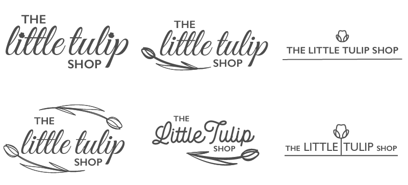
From the client’s detailed requirements we created initial concepts, exploring a number of cursive and handwritten typefaces as well as more contemporary, sans serif typefaces. We developed a range of tulip images to accompany the word mark in various styles from illustrative versions to more stylised icons to give greater variety across the initial concepts to explore.
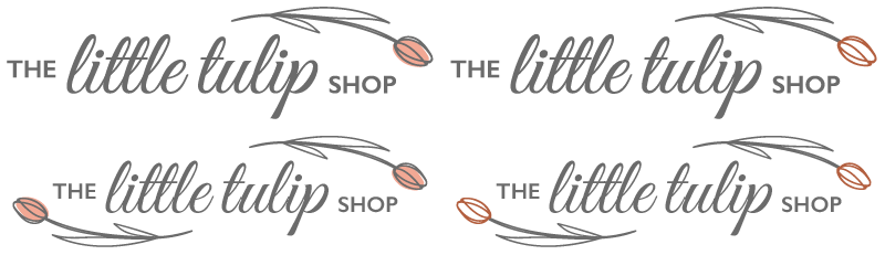
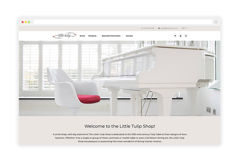
The selected design concept is based around a delicate continuous line representation of the tulip paired with a word mark featuring both cursive and sans serif typefaces. The overall composition of the logo was refined through subtle iterative work to the text and illustrative components ensuring spacing and balance allowed the logo to work in different contexts and at various sizes. We also applied a softer but refined palette of pink and grey to compliment the feminine aesthetic of the e-commerce website theme. A small but important detail was the development of the tulip illustrative component as a favicon featuring on the website visitors' browser tabs and extending the brand identity in this subtle and helpful way.

Final Solution
The finalised logo has enabled our client to establish branding consistent with the aesthetic of the tulip chair and table product range they sell, appealing to their target market and adding authenticity to the overall voice of the business.
Like what you see and ready to start?
Let's talk!
The easiest way is to select an open space in our calendar for a discovery call at your earliest convenience.
Book a call
We work with clients of various sizes and across a wide range of sectors. We provide the following services:
Digital Marketing
Digital marketing solutions driven by results, designed to enhance your online presence and engagement, fuelling business growth.
PPC SEO Email Marketing Marketing for Charities Social Media
Websites
Efficient web-based systems, leveraging database-driven digital products to streamline operations and enhance user engagement.
Marketing Ecommerce Websites for Charities Bespoke Web Applications