
 University Human Resources
UHR Annual Report 2018 and Leaflet
Overview
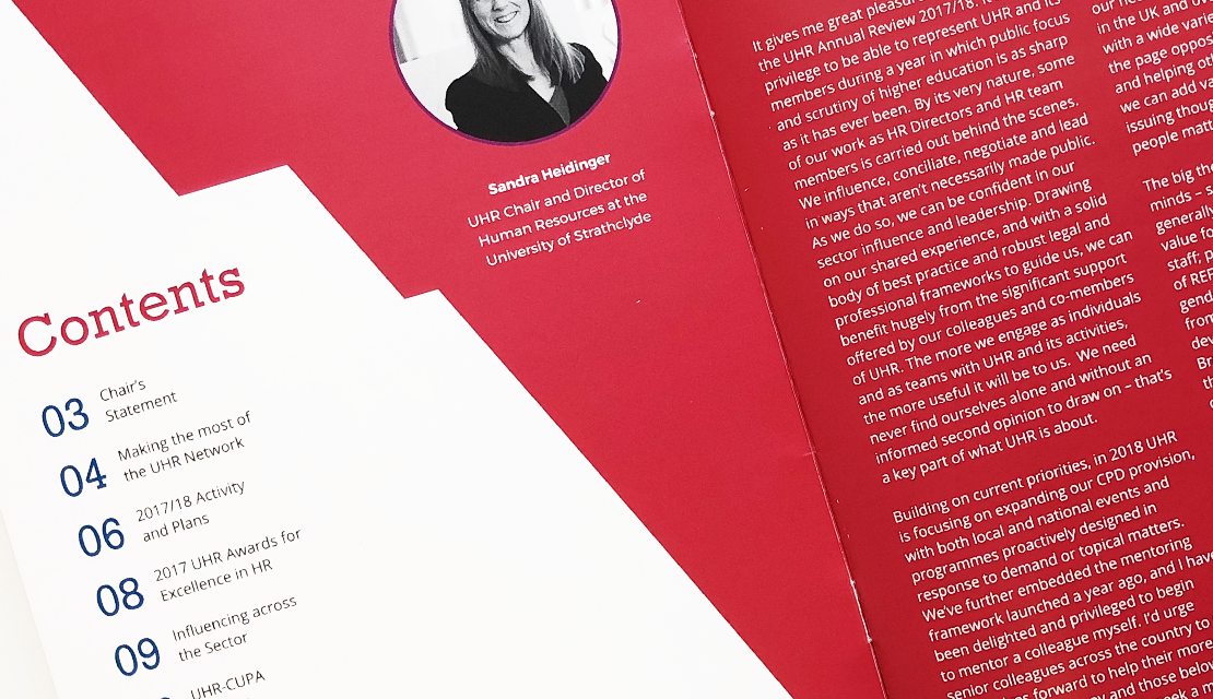
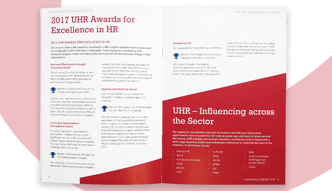
University Human Resources (UHR) is the professional membership organisation for those working in HR within Universities in the UK and Ireland. They produce annual reports and other publications, which are sent to their members. They approached us to help develop a visual language for their publications, beginning initially with their 2018 Annual Report and associated leaflet.
What we did
Brief
UHR have some basic branding, but no guidelines on its use. As such, the information and materials they publish and send out to their members have historically been a natural extension of this limited brand identity. As a result the materials they publish, have lacked a consistent visual style. Starting with their annual report and going forwards, they required a more distinctive identity to be worked throughout their publications.
Solution
In consultation with the client we adopted the vibrant magenta from their logo as a primary colour. Used in conjunction with angled block colour shapes throughout the documents, we were able to implement a strong, simple and consistent visual style.
Other colours from the logo were used sparingly to create small accents and points of interest. The use of block colour paired with bold serif headers helps bring emphasis and present the information clearly.
The flexibility of the shapes and clear text styles are simple to transfer to the variety of future UHR publications as we help them develop their overall brand and visual design system.
Like what you see and ready to start?
Let's talk!
The easiest way is to select an open space in our calendar for a discovery call at your earliest convenience.
Book a call
We work with clients of various sizes and across a wide range of sectors. We provide the following services:
Digital Marketing
Digital marketing solutions driven by results, designed to enhance your online presence and engagement, fuelling business growth.
PPC SEO Email Marketing Marketing for Charities Social Media
Websites
Efficient web-based systems, leveraging database-driven digital products to streamline operations and enhance user engagement.
Marketing Ecommerce Websites for Charities Bespoke Web Applications