
John Lewis Partnership Brand Identity

Rach Brind-Surch
17th September 2018
If you have been watching The Great British Bake Off, with the rest of the nation on a Tuesday night, you may have chanced upon the new John Lewis advertising campaign. Is it Christmas? No, it’s a new visual identity, a subtle but clever name change wrapped neatly in striped nostalgia by Pentagram Partner Harry Pearce.

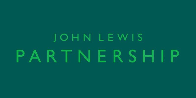
Not in fact an advert purely for John Lewis, this campaign is for the John Lewis Partnership, the parent company of both John Lewis and Waitrose. In the wake of the BHS Philip Green scandal, big-name companies are increasingly being put under pressure to be seen as virtuous. By incorporating an emphasis on cooperation and care for people and their businesses into their Brand Strategy, John Lewis Partnership has tackled this need.
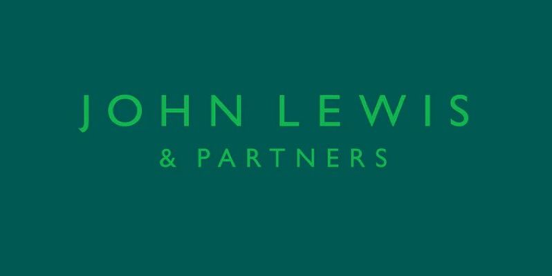
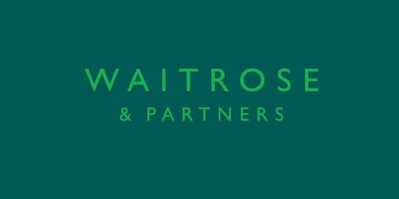
The John Lewis Partnership has run with this by capitalising on their distinctive business model, where employees across both their brands hold a partnership within the company. Hence ‘when you are part of it, you put your heart into it. For us, it’s personal’ tagline, clarifying the slightly baffling two and half minutes of Bohemian Rhapsody based marketing antics. All this to announce the addition of ‘& Partners’ to the John Lewis and Waitrose logotypes.
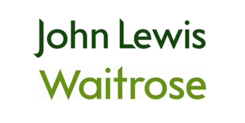
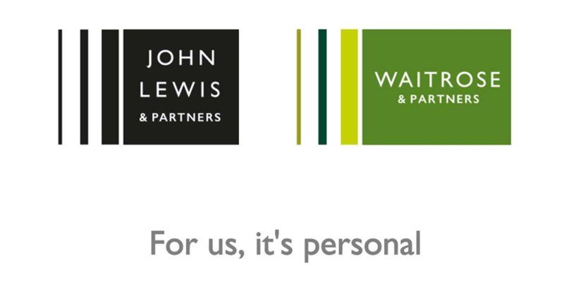
As well as the name change the visual identity has been overhauled. They have unified the three brands through the use of the sans serif font Gill Sans, already widely used by John Lewis. The simplicity is clever as across the two chains the application of the two word marks is incredibly broad, working both at large and small scale.
Another distinctive addition is the use of a striped pattern influenced by John Lewis’ earlier diamond pattern branding from the 60s. The proportion of the new stripes was directly taken from the Peter Hatch design and though the colours, angles and scale may be more fluid, the proportion does not waiver.
Some differences are left between Waitrose & Partners and John Lewis & Partners. Whilst all colour has been stripped from John Lewis, Waitrose has held fast to its distinctive green and added additional green tones and shades to give the strip a bright and fresh appearance. Personally, I find the more colourful Waitrose applications much more interesting and modern, whilst the John Lewis mark, when restrained within its black box feels underdeveloped and too close to Marks and Spencer.
I especially enjoy the secondary palette that Waitrose Partners have implemented across some of their products. Pentagram’s wide-ranging examples of the different applications show just how well the initially bland seeming striped pattern can be applied to create a recognisable visual for the John Lewis Partnership.
Overall the move by the John Lewis Partnership is quite a change and one that works and seems well considered. The tone remains premium whilst promoting a warm feeling of togetherness with its employees; no mean feat for a typical middle-class brand. The nod to its heritage whilst modernising is generally well realised and I am looking forward to seeing those stripy shoppers in a Waitrose near me soon.
If you are an umbrella organisation or business, looking to create a more consistent brand identity, we can help. We generate brand strategies that, when implemented, create professional, integrated user experiences and build cohesion within your organisation. Our six-stage framework ensures a clear road map for branding success.
Like what you see and ready to start?
Let's talk!
The easiest way is to select an open space in our calendar for a discovery call at your earliest convenience.
Book a call
We work with clients of various sizes and across a wide range of sectors. We provide the following services:
Digital Marketing
Digital marketing solutions driven by results, designed to enhance your online presence and engagement, fuelling business growth.
PPC SEO Email Marketing Marketing for Charities Social Media
Websites
Efficient web-based systems, leveraging database-driven digital products to streamline operations and enhance user engagement.
Marketing Ecommerce Websites for Charities Bespoke Web Applications