
 BAST Inc
A Brand Identity for Bast Inc
BAST Inc are a pharmacometrics consultancy working to make advances in drug development since 1991. They specialise in providing state-of-the-art modelling and simulation support to large and small companies in the pharmaceutical sector in order to enable their clients to make informed decisions and ensure that the right drug is given at the right dose to the right patient population.
Background
As part of a wider project involving the development of a new website to position their business inline with the type of work they do and the clients they work with, our initial brand audit resulted in the potential to develop their brand identity, as they had no clear visual identity aligned with their online and offline presence.
Brief
BAST Inc had existing brand colours of blue and grey, however beyond that they were happy to completely redefine what branding they had.
Process
We started the process by conducting a brand audit in order to explore their key brand attributes as a well established company. They described themselves as reliable and professional, working with scientific integrity to help their clients reduce risk to all stakeholders in drug development. Their most distinctive attribute is that they are able to work flexibly and agiley in order to meet client deadlines. We also created a client profile in order to establish their target audience.
Once we had established these foundations we explored the branding of their closest competitors in order to identify what conventions there were in the world of pharmaceuticals and pharmacometrics in particular. It showed us which colours were more predominant and where we could differ to create something fresh but not completely alien to the sector. We also asked BAST Inc what they liked and disliked most about their competitors in order to get a more in-depth idea of their aesthetic taste.
A range of references was gathered for internal use which related to pharmacology, in order to establish some visual cues which would infer the role of the company and inform our imagery within the logomark.
As part of the rebranding, we also created an icon set relating to the services BAST Inc provides. Time was taken to try and understand what individualised each service so that we could highlight its precise features in an icon or illustration. This was particularly important in this case as BAST Inc are an incredibly academically skilled company, using scientific terminology specific to the study of health and pharmaceuticals.
For the rapid ideation phase, we sketched a large range of concepts, based around the reference material, the shapes that it suggested and the letter forms of the words. As modelling uses data sets and graphs to help show the performance of drugs in which individuals and how they’re affected, our concepts involved abstractions of graphs, the shape of tablets as well as neural networks and the shapes they made.
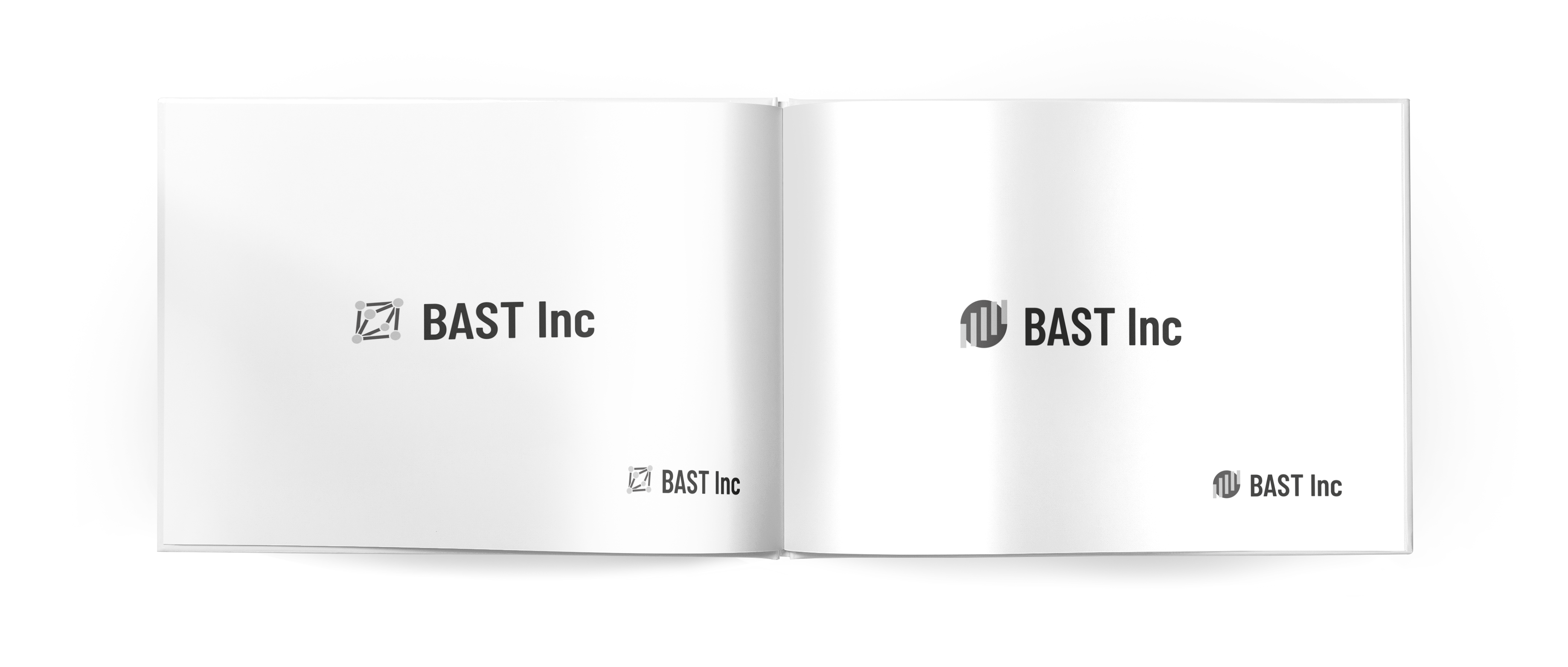
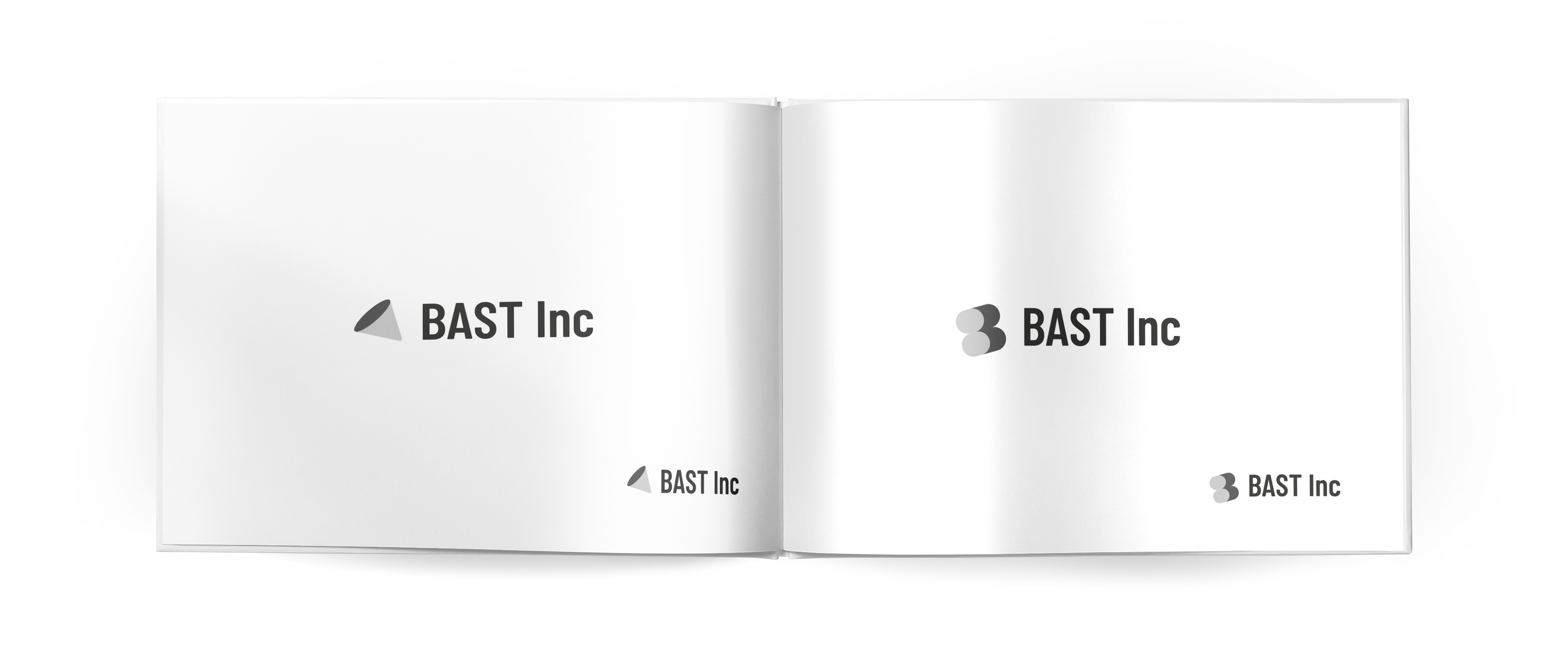
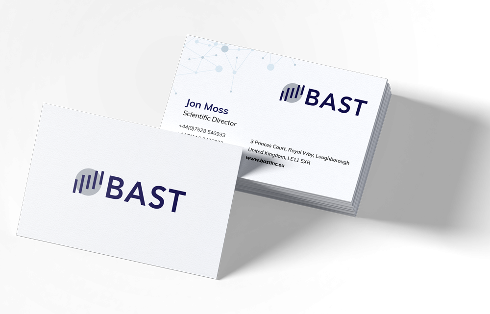
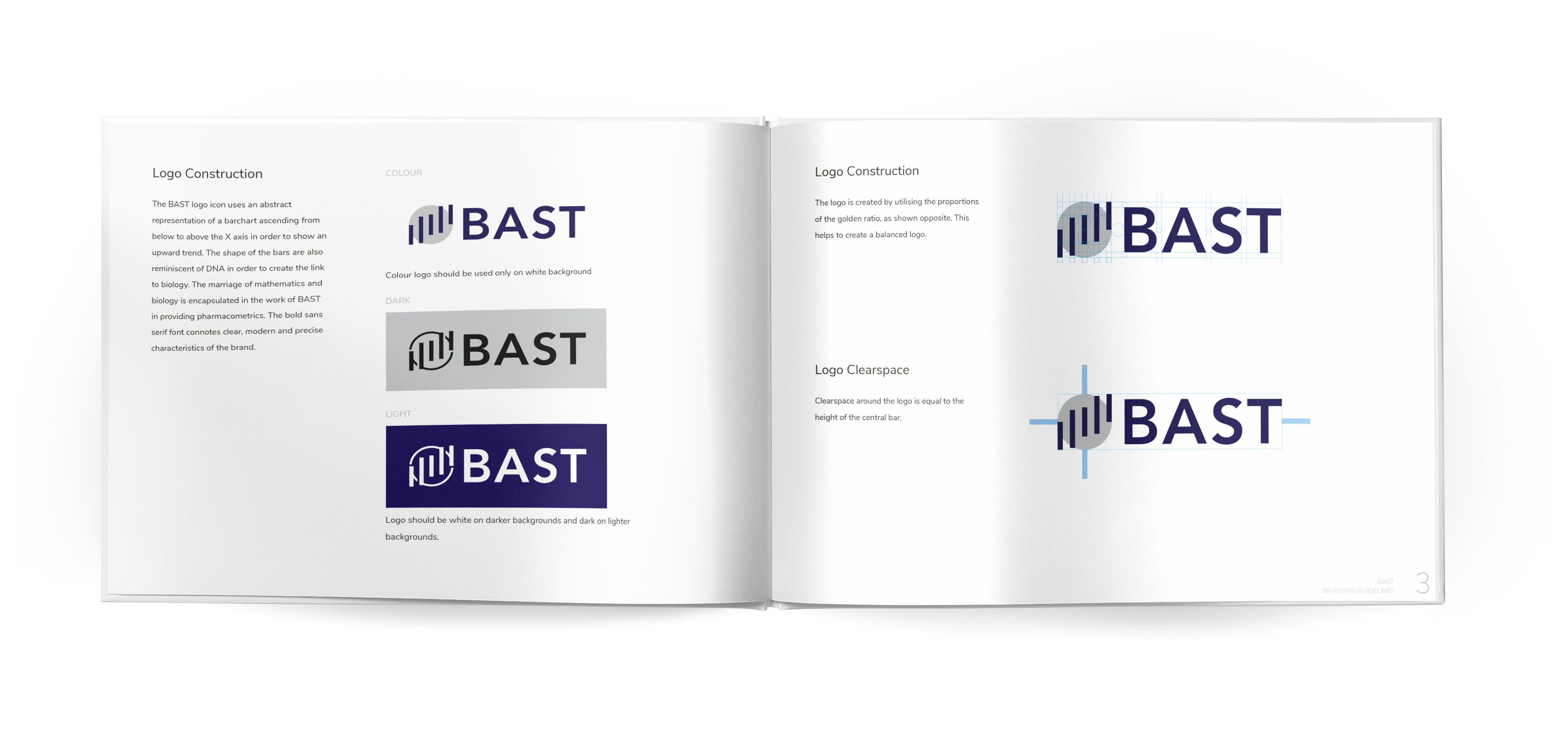
BAST Inc liked two concepts in particular and chose one which involved an abstraction of a bar chart rising from below the horizontal axis to form an upward curve, centred on a circle; a trust building shape. We had previously established that they wanted strong sans serif letterforms within their wordmark and they also chose to remove the ‘Inc’ from the logo in order to create a more impactful and cleaner identity.
We explored a number of fonts and colour combinations for the logo, whilst further refining the shape, creating a visually pleasing proportion to the overall form. .
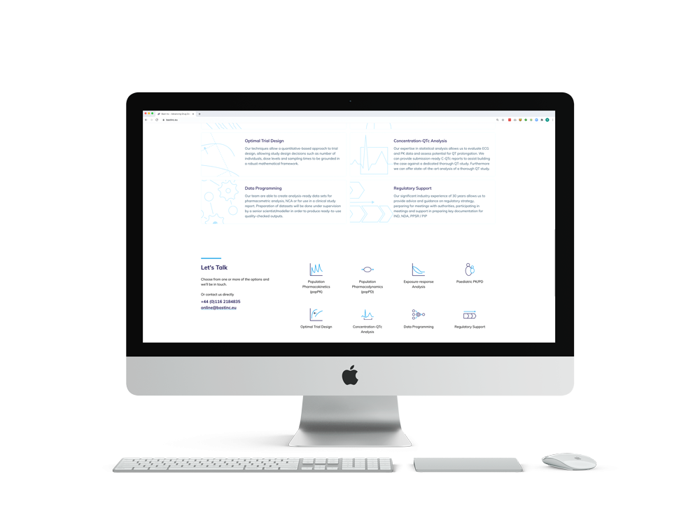
As we had worked on the abstraction of a graph for the main image we felt this would be a good direction for the service icons and asked for some images o f what key data for each service would look like. We had found this the easiest way to differentiate between the services in an original way which was still descriptive. The only exception where we did not use graphs was for ‘Paediatric PK PD’ as it seemed to make more sense to highlight that it was specifically around children and babies.
We followed a similar pattern of work with some initial sketches before some more refined drawings, though the range of possibilities were far less open as we had clear references to work from in the data and we did not want to abstract these shapes past the point of being recognisable.
Final Solution
The end result is a more balanced and refined logomark, exuding competence and professionalism, utilising the circle trust builder in a new way. The abstract bar chart creates a sense of upward movement, inferring success or achievement and provides a pleasing balance and symmetry to the overall look of the logo.
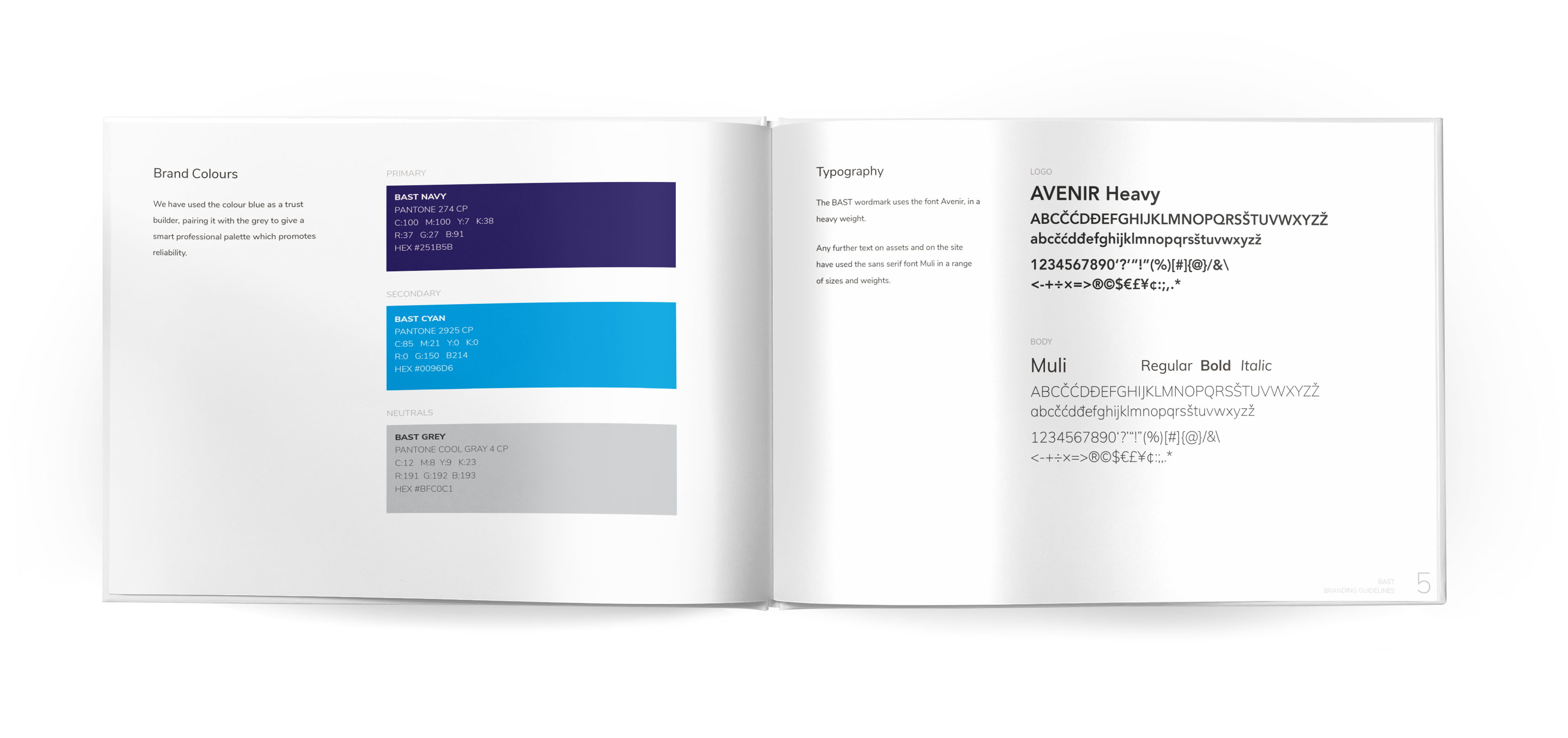
The colour palette remained blue and grey as requested, but we introduced a brighter blue accent which stands out against the more sedate navy blue and grey of the final logo.
Applications for the supporting service icons include use on the website and provide the basis to be included as abstract imagery within any marketing and promotional materials, creating a clear visual link to the core services that BAST Inc provides to its clients.
Like what you see and ready to start?
Let's talk!
The easiest way is to select an open space in our calendar for a discovery call at your earliest convenience.
Book a call
We work with clients of various sizes and across a wide range of sectors. We provide the following services:
Digital Marketing
Digital marketing solutions driven by results, designed to enhance your online presence and engagement, fuelling business growth.
PPC SEO Email Marketing Marketing for Charities Social Media
Websites
Efficient web-based systems, leveraging database-driven digital products to streamline operations and enhance user engagement.
Marketing Ecommerce Websites for Charities Bespoke Web Applications