
 Paul Michel Investments
A new brand Identity for Paul Michel Investments
Paul Michel Investments is a company created by business finance specialist Paul Michel, which aims to help businesses and start-ups get ahead. He works to provide expert advice to businesses, fostering trusting relationships with them in order to grow their capital.
What we did
Brief
Paul wanted a brand focused around his name, as it was his knowledge and expertise which was key to the brand. In order to develop partnerships with businesses he needed a memorable yet mature and professional brand. It needed to help foster trust in him and his ability to take care of the company's capital in order for them to confidently take his investment advice. As an essential part of his networking to generate new business, we needed to create a logo that would achieve a great first impression and sit well on a professional business card. We were also asked to start applying some of the brand styles and logos to other print marketing, such as leaflets, creating a good foundation of consistent branding guidelines which could be extended and applied to future marketing materials as his business grows.
Process
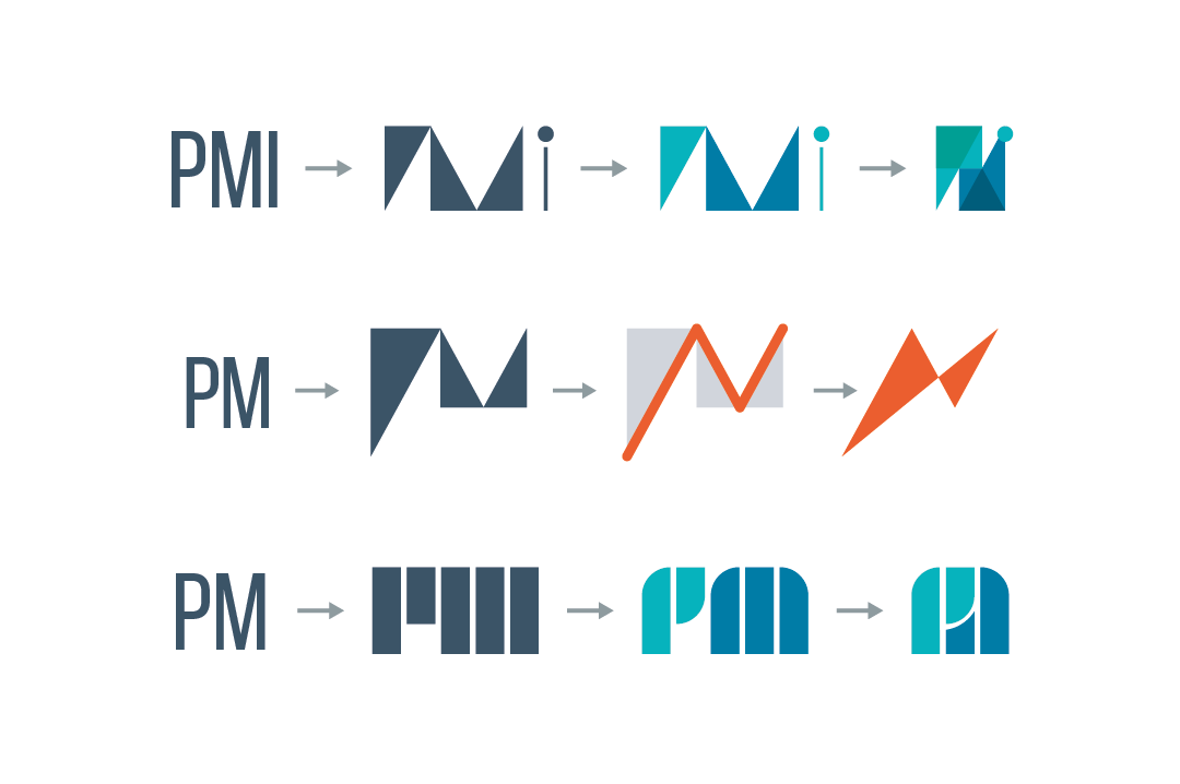
As the logo was the central element to business card, we began with some initial sketches. Due to the Paul Michel name and knowledge being the focal point of the brand, the initial concept generation involved taking the letter forms of PM or PMI and exploring the various abstract shapes they could be manipulated to create. We also explored concepts which were more literal to investments such as a clam shell and pearl, or an acorn, as it showed how something can grow into something bigger or more precious.
The best sketches were then sharpened up and refined into digital examples and applied a palette of cool colours. We chose to work with blue as the primary brand colour as it suggests trust, whilst the inclusion of some greens connotes money, perfect. We also looked at some simple clean sans serif word marks. We wanted to keep the professional, sophisticated impact without making it feel unapproachable for smaller business and so utilising title case for Paul’s name gave it an heir of friendliness.
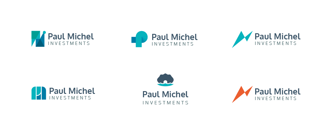
We chose the strongest concepts to present to Paul to choose between. We provided clear explanations of our thinking and the process of how we came to each abstract concept. He chose two designs which he preferred and so we then moved on to developing some business cards with the two logos in order to show them in context. During this process we refined the logos further and began to consider the wider style applications of the brand colours and font styles.
Once we had created the business cards and mocked them up to give a realistic example of the finished card Paul was able to choose his favourite solution.
Final solution
The final outcome chosen was an angular logo created by constructing the initials P, M and I from a variety of right angled triangles and a circle for the dot and the I, the shapes are conjoined to create a quirky, abstract form in a restricted pallet of blues and greens which sits alongside a more serious grey sans serif word-mark. The scalable triangle forms and dot are easily applied to future designs, an example of which is seen on the business card design.
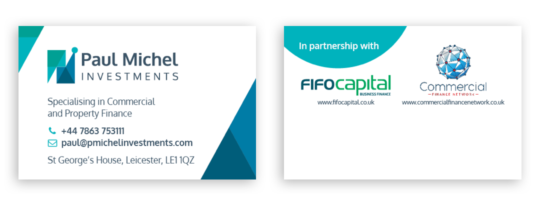
Keeping the clean, paired back approach, we designed the cards around the shapes in the logo and utilised the various weights of the fonts style. Paul wanted to leave space for anyone to write some details on the back if required, so the dots and triangles helped to provide some interest whilst not dominating the card with colour.
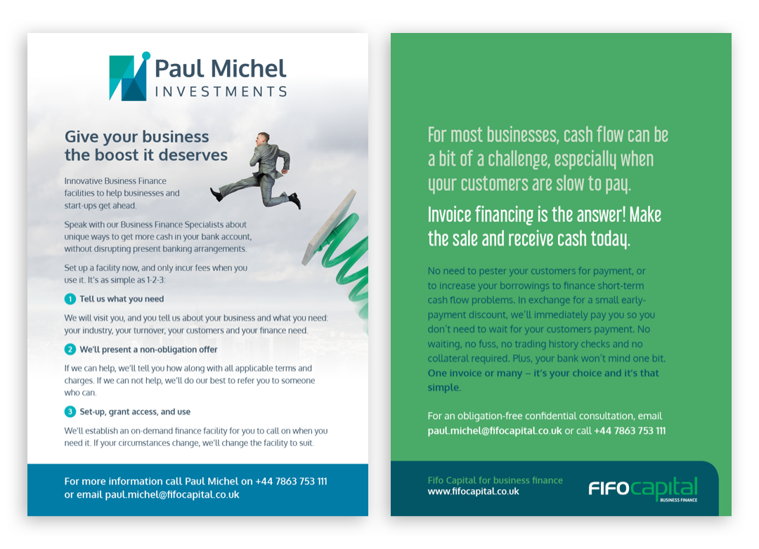
The chosen colour palette worked well alongside the colours of Paul’s partners, which proved beneficial in the leaflet design we also created for him. Subtle elements such as the blue dots around the numbered bullets, were carried across and the versatile typeface with its large variety of weights gave us flexibility and cohesion between the cards and the flyers.
Like what you see and ready to start?
Let's talk!
The easiest way is to select an open space in our calendar for a discovery call at your earliest convenience.
Book a call
We work with clients of various sizes and across a wide range of sectors. We provide the following services:
Digital Marketing
Digital marketing solutions driven by results, designed to enhance your online presence and engagement, fuelling business growth.
PPC SEO Email Marketing Marketing for Charities Social Media
Websites
Efficient web-based systems, leveraging database-driven digital products to streamline operations and enhance user engagement.
Marketing Ecommerce Websites for Charities Bespoke Web Applications