
 AUDE
AUDE
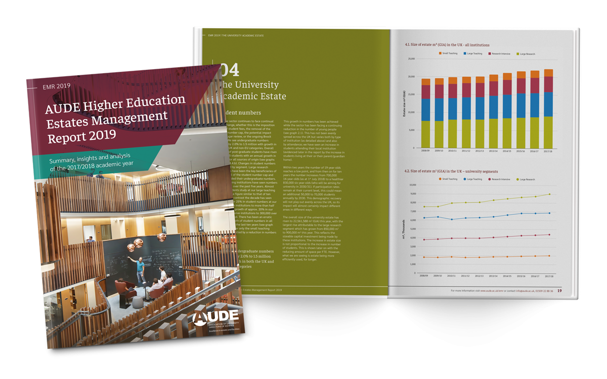
AUDE Estate Management Report
Background
The Association of University Directors of Estates (AUDE) promotes excellence in the strategic planning, management, operation and development of Higher Education estates and facilities. Their members are publicly funded higher education teaching and research bodies within the UK. Every year they create a report which is widely used by estate managers throughout the year in order to make informed management decisions.
Brief
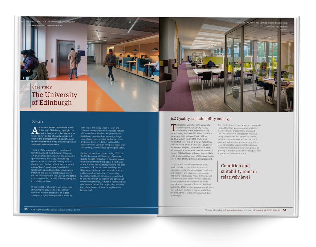
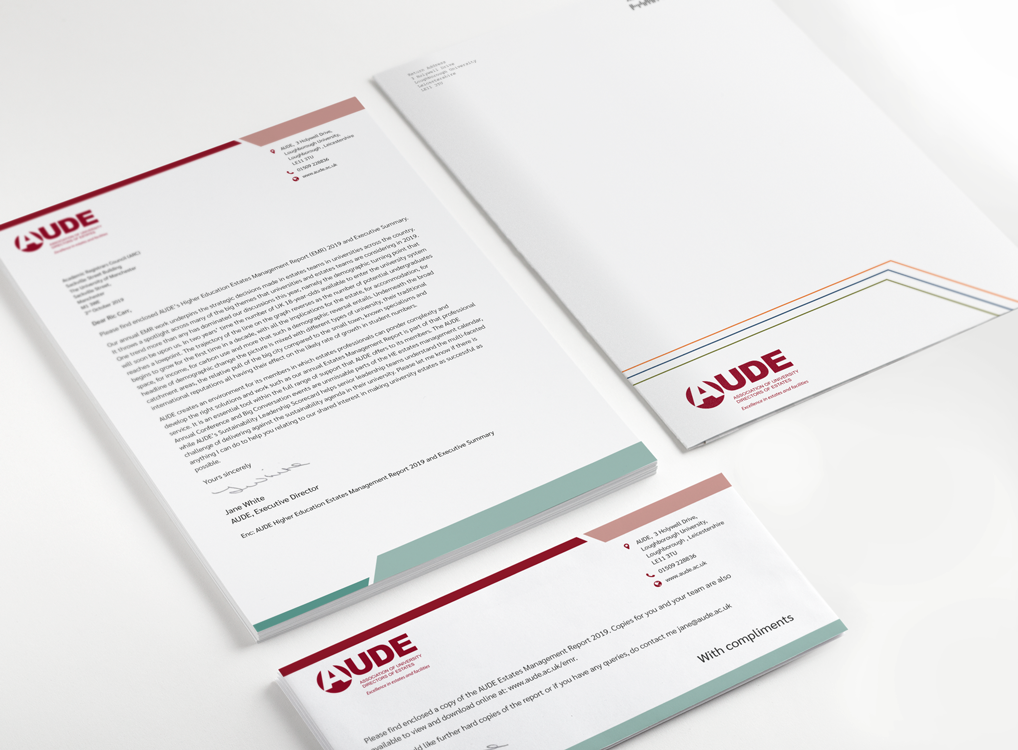
We were approached to design, print and deliver the 2019 report. Working closely with AUDE and their partners who collated and refined the datasets, we were responsible for processing and formatting the data and report content, creating a final 100 page report featuring over 60 graphs delivering clear data. Additional to the full report was an executive summary report which highlighted key areas. As the project involved the complete fulfilment including delivery to members, a full set of branded stationery that matches the report design styles was developed, including letterheads, compliments slips and envelopes. Fulfilment included organising print, packaging of the various different combinations of materials and organised delivery to over 1,600 addresses, in the UK and further afield.
Process
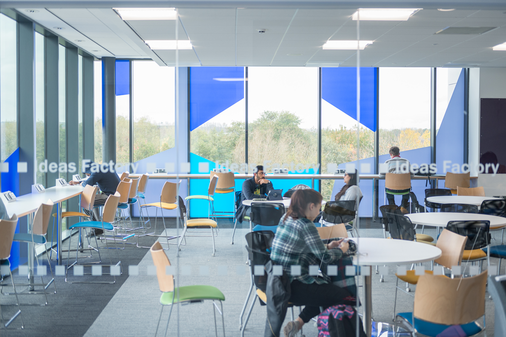
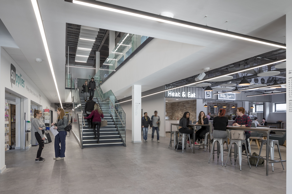
Because we had so many different elements to work on, we started by looking at previous reports and with AUDE to pin down specific sections and their styles whilst the full content was still being written, collated or finalised. This meant that we could create a couple of colour palettes and styles alongside some chart styles as part of the report which AUDE could choose between. Once these were established we could roughly map out the full layout we were expecting, replacing dummy text with content as and when it was received and replacing any stock images with photographs we received from the various institutions, as they were made available.
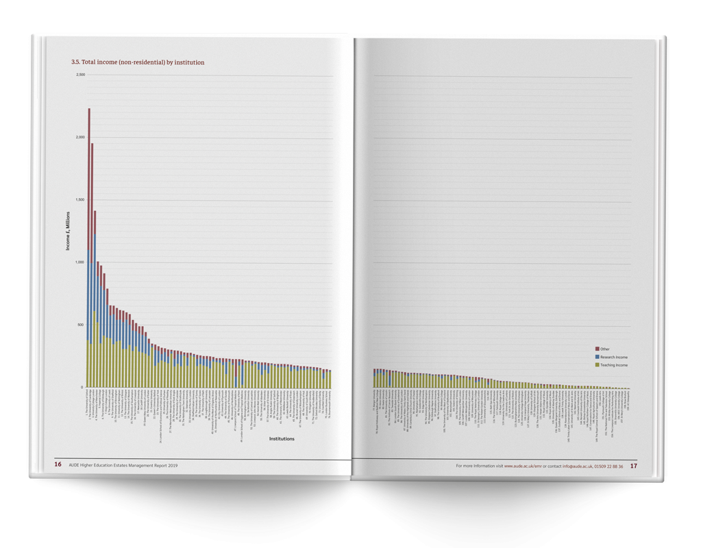
Some of the charts involved very large data sets, so we had to find a way of delivering it clearly, across an A3 spread, where axis labels were still clear and readable despite their size. We explored various print solutions including fold-outs, but opted for a simple solution of a secondary list of labels which could be used as a reference for each of the larger charts in order to keep to the budget of the project.
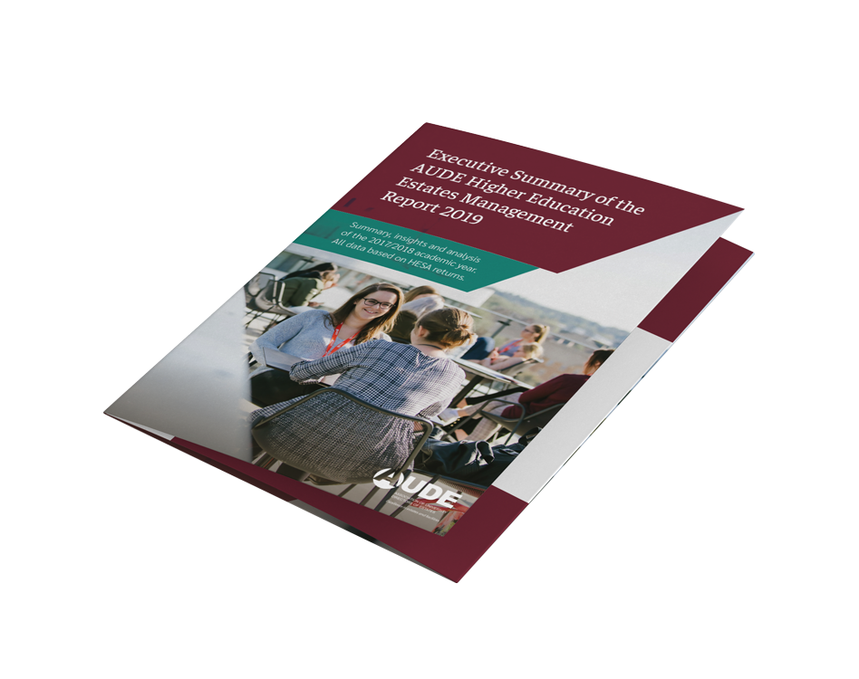
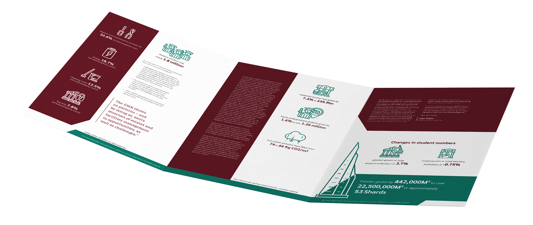
The executive summary is a double-sided, three panel, gate folded A4 document. Once we had established the main text styles in the main report it was relatively simple to create a complimentary design for the summary. It had the addition of a set of icons to illustrate the key statistics that they wanted to pull out of the document.
By the time we had established the design of the summary and the main report, creating a set of stationery which was in keeping with the other two print materials was relatively simple. The main challenges were around the specifications for how the postage information needed to look and be positioned.
Once everything was signed off we were able to print, package and deliver the full quantity as well as providing a pdf version for download.
Final solution
Throughout the process we worked closely with specific contacts at AUDE, and CBRE—who were responsible for the research data. The project involved further input from other stakeholders within some of AUDE’s member organisations providing report content and feedback. We were able to help provide a framework to make the feedback process smooth and effective, reducing overall time taken to collate the feedback, minimising errors and ensuring all feedback was acted upon.
AUDE were really pleased with the overall appearance of the design and especially the legibility of the large data sets.
We were pleased to meet the deadline to a high standard despite the large quantities of print material we needed to package. This involved three separate combinations of materials being each individually tailored to match the personalised letters or compliments slips with the envelope addressed to the various members both in the UK and globally.
Like what you see and ready to start?
Let's talk!
The easiest way is to select an open space in our calendar for a discovery call at your earliest convenience.
Book a call
We work with clients of various sizes and across a wide range of sectors. We provide the following services:
Digital Marketing
Digital marketing solutions driven by results, designed to enhance your online presence and engagement, fuelling business growth.
PPC SEO Email Marketing Marketing for Charities Social Media
Websites
Efficient web-based systems, leveraging database-driven digital products to streamline operations and enhance user engagement.
Marketing Ecommerce Websites for Charities Bespoke Web Applications