
Visual Identity
Whilst the term ‘branding’ refers specifically to how a brand is actively shaped and made more distinctive by marketing strategies and ‘brand’ relates to how the world generally perceive your company, ‘brand identity’ is the collection of elements or assets which are specifically designed in order to create the image you want to portray to the wider world and your customer.
A brand itself is such an all encompassing part of your business, referring to many intangible aspects, such as values and goals. Brand identity should help you solidify those aspects and help to pin them down. It is important, as it is not enough to simply decide what your brand is and then hope that your consumer would automatically perceive you in that way. A certain amount of work must be done in order to achieve the reputation and associations you wish to cultivate.
Brand identity will be your stepping stones and in communicating and upholding those values for customers. It's what makes that instant recognition of your brand and solidifies your identity. Designing this strategic visual identity is what strengthens the connection between you and your customers, building a strong sense of loyalty and controlling perception of your brand.
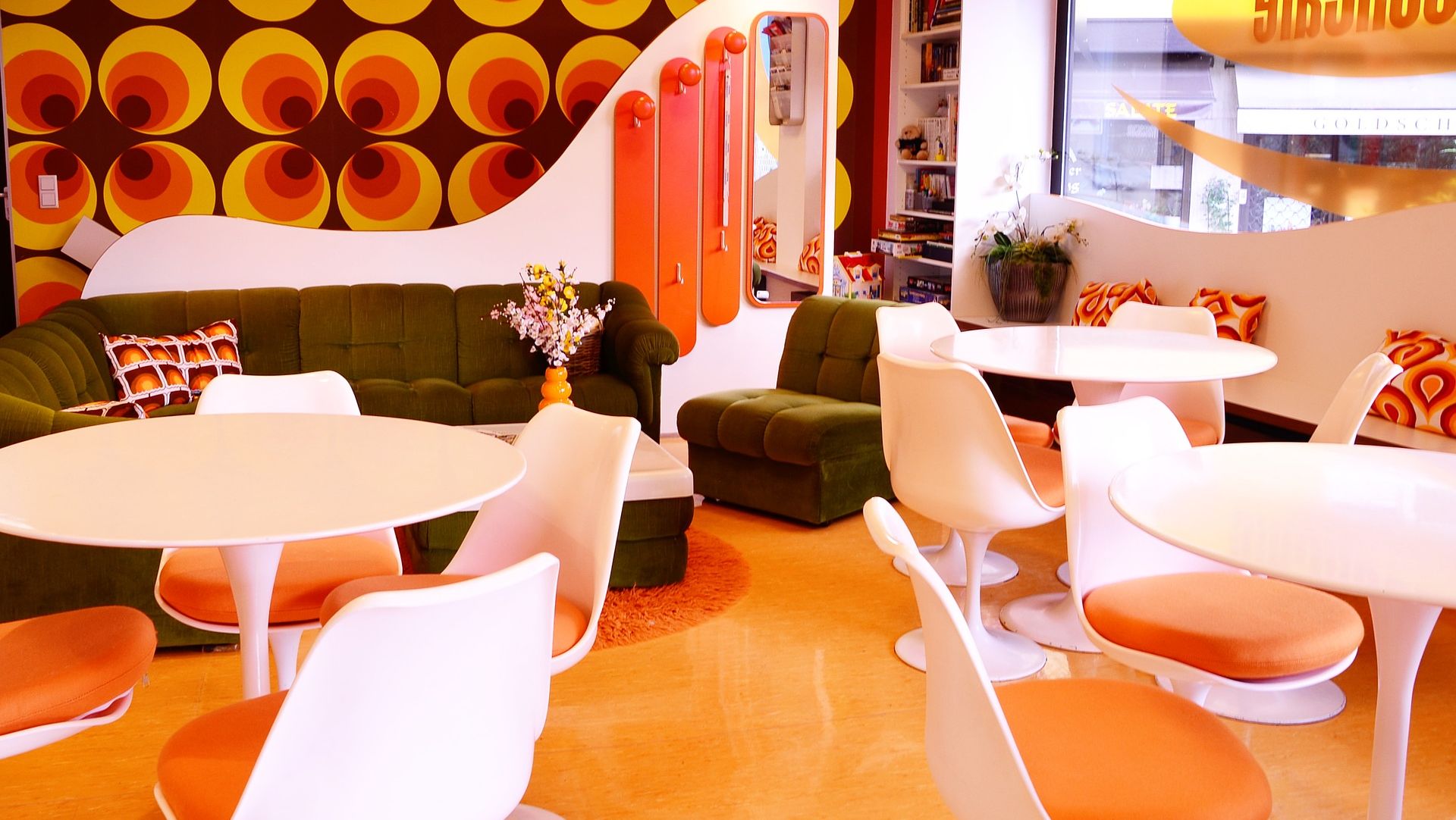
Litle Tulip Shop
A New Brand Identity Application for Little Tulip
See how we refreshed and updated the brand identity of ecommerce store Tulip Shop
Brand Elements - The building blocks of your distinctive visual language
A good brand identity considers the vast amount of channels which you will want to utilise in order to communicate your brand. The most common elements which a company needs to establish in their brand identity as a foundation are:
Typography
Your font choice can say so much about your brand personality in only a single word on your packaging. Whilst a serif font, such as Times New Roman, gives the impressions of tradition and heritage, a sans serif font such as Helvetica can appear modern and professional. Script typography can range from lending a handmade, personal impression to your brand to a more luxurious feel through its similarity to handwritten messages. Besides these more common classifications of fonts, there is also a vast array of display fonts created with their own specialised elements. Some companies may even go so far as to develop their own brand font.
Colour palette
This is a fairly obvious part of your brand identity. We know that specific colours or colour combinations can have different associations psychologically for your customers. Blue is a trust building colour which communicates stability, whilst green can relate to money or nature and yellow is sunny, fun and joyful
Form or Shape
Whilst the first two were probably more familiar to those less acquainted with design, this aspect of brand identity begins to explore the shape and style of brand. Choices such as should elements within your brand consists of rounded or straight edged shape can suggest either softness and femininity or strength and stability
Once these key building blocks are decided on and agreed, your design team can then embark on designing an agreed toolkit of elements which will support and build your brand identity.
Brand Toolkit - a collection of purpose built brand assets to suit your needs
Creating a flexible design tool kit is imperative to creating a strong brand identity.Your corporate design assets are the tangible elements that will determine how your brand is perceived. Assets such as your logo, your web design, your graphics for social media, business stationary, livery for staff and vehicles and packaging all could be a part of that brand identity.
Whilst designing a brand identity the key is to have clear and comprehensive guidance, with flexibility built in. Brand guidance is critical to this as it’s important to avoid any dilution of the brand. When guidance is unclear or does not extend to all the areas it needs to, it can result in visuals which feel odd or out of step with the overall brand identity creating inconsistency. This can at worst cause confusion and poor user experience but also generate unnecessary noise which distracts from the core identity. Equally though there must be enough provision built into the guidelines to be able work on multiple channels, across many themes. You can work to utilise diverse content within the restrictions of your guidance.
A good example of this is using a specific illustration style developed for your brand to create a library of illustrations which can be applied across a number of platforms. Or it could involve something more subtle such as templates for layouts for specific marketing or documents, or framing options for images.
Once all your assets, and the guidance is agreed upon it can then be applied and your brand identity is born. This is however only the beginning of your organisation’s journey. As a part of delivery of your guidelines and implementation it is wise to train some of your company in your brand so that they can apply it in house in all aspects of your business. It will also be essential over time to add to and widen your brand or it may be that your business grows and new pathways to your business require their own additional imagery or distinct branding.

Like what you see and ready to start?
Let's talk!
The easiest way is to select an open space in our calendar for a discovery call at your earliest convenience.
Book a call
We work with clients of various sizes and across a wide range of sectors. We provide the following services:
Digital Marketing
Digital marketing solutions driven by results, designed to enhance your online presence and engagement, fuelling business growth.
PPC SEO Email Marketing Marketing for Charities Social Media
Websites
Efficient web-based systems, leveraging database-driven digital products to streamline operations and enhance user engagement.
Marketing Ecommerce Websites for Charities Bespoke Web Applications