
 BUFDG
BUFDG
A brand identity for BUFDG Annual Conference 2020
Background
The British University Finance Directors Group (BUFDG) are the representative body for higher education finance staff throughout the United Kingdom. We have worked with them on a number of different design projects over the past few years, creating many illustrated reports.
We have helped create some cohesion through their various print projects, creating engaging yet informative designs which show data and information in a clear and interesting way. In this time we have also fostered a good working relationship with them and have explored a range of different illustration styles in order to keep things fresh and interesting.
Brief
Each year BUFDG holds its conference in the UK, to which their members are invited. This year we were asked to create a logo and a set of complementary graphics to be used to brand the event.
When we have worked on reports for BUFDG previously, they have supplied brand elements to advertise the annual conference, however, this was the first time that we had creative control to establish this year’s conference branding.
We were asked to create:
- Brand identity
- Visual assets to support the brand identity
- Programme cover design
- Brand guidelines
Along with the specification for delivery BUFDG explained that although there was no specific theme for the conference it would take place in Salford in a variety of venues from which we could draw inspiration and direction.
Process
We started the design process by gathering imagery and ideas around three locations and themes suggested by BUFDG:
- Salford and Manchester, in particular the history associated with these areas.
- Museum of Science and Industry as this was where the conference dinner was held.
- The work of L S Lowry as one of the venues was The Lowry Hotel and he is a well respected historical figure within Salford and well known beyond.
We created three concept boards suggesting some themes for the brand identity. These included a focus on the Manchester worker bee image and strong visuals around honeycomb and cogs in order to evoke the city’s strong industrial past. Another concept was inspired by the work of Lowry which played with abstracting some of the colours and shapes of his brush strokes to create crowd forms and patterns.
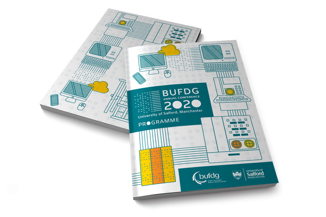
The concept they decided to pursue was instead focused on the surroundings of the Museum of Science and Industry. After some research we found out that Salford had a booming cotton industry, its usage of the Jacquard Loom meant that Jacquard patterns became plentiful, and the pattern cards with their distinctive dot layouts were mentioned by Ada Lovelace to draw a correlation between the pattern cards and early computer codes.
The museum has a replica of the first ever computer able to remember a program - named Baby. The delegate dinner was to be set next to the replica Baby and so it worked well to highlight the city of Salford and it’s particular history in a new and interesting way. We wanted to use the dot pattern of the jacquard card as a motif throughout the branding at various scales, with computing imagery also running throughout the visuals to draw the link between the two.
After a clear concept was established we explored two different approaches to creating the image, one more realistic and utilising photography, the other using stylised illustrations, which reference coding, early computers and the birth of the internet. BUFDG chose the latter as it was more flexible and lent itself to creating spot illustrations which could be used on various applications throughout the conference.
With a clear aesthetic established early on we were then able to work on the logo and visual elements before finalising the guidelines and applying the assets to the cover design for the programme.
As is often the case with any BUFDG colour scheme we used a limited cool colour palette with a bright accent colours in order to work alongside shades of teal from their existing logo.
Final solution
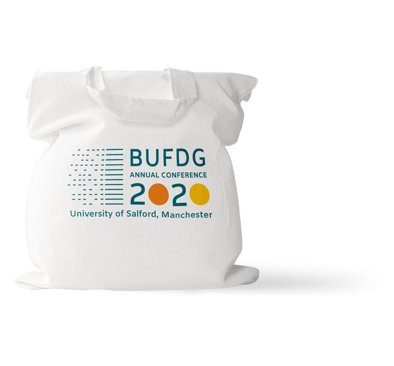
The finished result is a bold logo with a sans serif font, which was strongly influenced by the dot and dash patterns of the Jacquard cards. We created a variety of versions of the logo to work with or without certain information and in different scenarios providing great flexibility for conference promotion and venue materials.
We also created a range of illustrations which worked separately as ‘computers through the ages’ spot illustrations, and as a combined timeline of computing which forms the cover page of the programme.
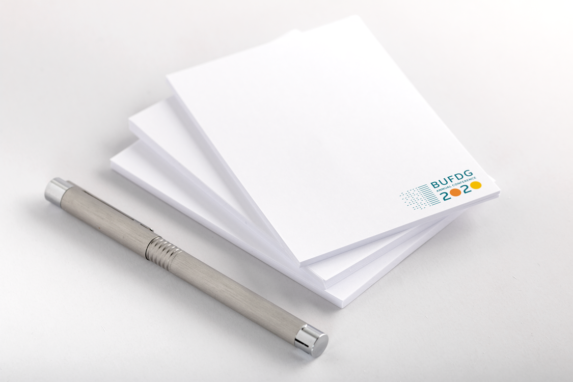
Additionally we generated a dot pattern graphic which could be applied as a texture layer to the various items or branded ephemera for the event.
Like what you see and ready to start?
Let's talk!
The easiest way is to select an open space in our calendar for a discovery call at your earliest convenience.
Book a call
We work with clients of various sizes and across a wide range of sectors. We provide the following services:
Digital Marketing
Digital marketing solutions driven by results, designed to enhance your online presence and engagement, fuelling business growth.
PPC SEO Email Marketing Marketing for Charities Social Media
Websites
Efficient web-based systems, leveraging database-driven digital products to streamline operations and enhance user engagement.
Marketing Ecommerce Websites for Charities Bespoke Web Applications