
 BUFDG
BUFDG
Designing a guide to finance publication for print and digital
Background
We have been creating printed reports for the The British University Finance Directors Group (BUFDG) for a number of years now. As the representative body for higher education finance staff throughout the United Kingdom, they need both annual reports creating as well as bespoke engagement reports for each member of their group.
Over the years we have been able to create a range of different illustrations, and styles for their reports, which helps to keep them engaging and interesting for the reader and has created a visual language for their brand.
Last year they asked us to help with something slightly different. We updated a Guide to University Finance for them, an outline of everything someone would need to know to start out in University Finance.
The guide had been created some years ago but had to be completely reworked and rewritten in order to meet current financial guidance.
One of the challenges frequently faced is how to make what can be a dry subject area visually engaging and unfortunately the original guide though cleanly and professionally laid out was lacking in the colour and illustration that we had come to work into other publications from BUFDG
We were able to create a completely modern and colourful finished product which was provided both in print and digital formats with its own bespoke set of chapter illustrations, illustrated cover and spot illustrations. It was downloaded by many of their users and also mailed out to their membership.
Brief
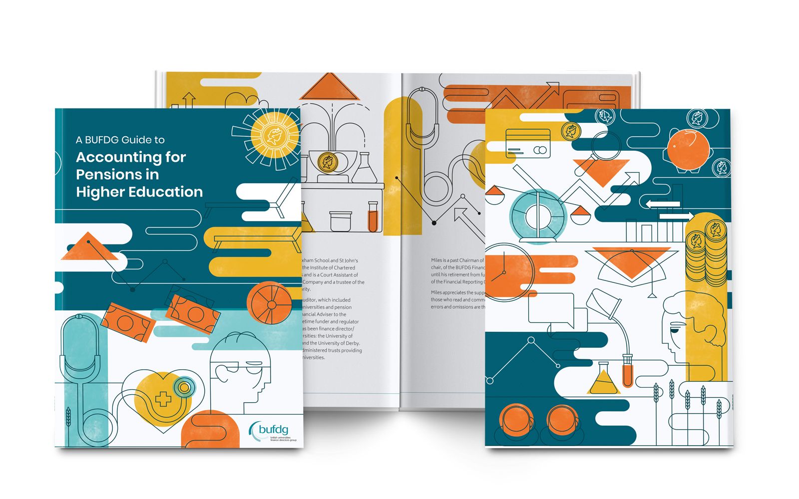
After the success of the last guide BUFDG approached us with a brand new guide written by Miles Hedges, to help explain pension schemes for those in Higher Education. Written for university governors, non-accounting staff, students, staff representatives and student representatives as well as for Finance Directors and colleagues in finance teams, it had a lot of text and tables as well as quotes from various legislation or guidance.
We were asked to create a second guide in line with the style of the first with a view to creating more in future in order to create a set. Currently this edition was for digital distribution only, as that proved very successful last time, but with a view to potential printing further down the line.
Process
Having already created a style for the previous guide we had already established elements such as typography and illustration style and texture.
We had created a strong contrasting palette for the first guide with a focus on green and so wanted to adjust that to create a clear difference without losing the vibrancy and life of the original palette. We settled on utilising a darker blue, almost teal for the cover with orange accents relied upon throughout alongside lighter blues.
As with the type we were able to recycle many of the illustrated elements but also create new imagery around the theme of ageing, savings for a rainy day, making hay whilst the sun shines and pension pots. This meant that the additional illustrations still felt fresh without losing the link to prior guides.
As this guide was written by a different author there are obvious differences in the copy. He favoured larger highlighted sections of tex, taking quotes and examples from existing documents concerning pension schemes. This meant that whereas last year we had created a texture pull quote block we instead opted for larger subtle highlights in a translucent orange which served to break up the pages nicely.
Additional changes were to the table styles, however items like the glossary remained the same except for some slight changes to the colour, and whilst the layout of the cover was very similar the colours and content of the cover design altered to reflect pensions using some of the fresh illustration elements.
Thank goodness for good designers!
Miles Hedges
The Author
Final solution
The final outcome was an extremely satisfying sequel to a project that we had really enjoyed working on previously. The colour palette was especially pleasing to work with and gave a greater variation of colours which could be used within the text.
We managed to keep the paired back professionalism of the clear and legible layouts. The finish is fresh and modern, and yet we have still kept that light, whimsical and engaging fun from the bright, bold illustrations.
The inclusion of interactive elements within the contents and further reading block will also make it easier to navigate for the user who will be viewing it digitally.
The author was very pleased with how the final design came together and congratulated us for our efforts.
This is an impressive piece of work (and also very professionally designed) ... It will be a very useful grounding for new staff here to understand the pensions landscape in universities and the related accounting challenges.
A BUFDG Member

Like what you see and ready to start?
Let's talk!
The easiest way is to select an open space in our calendar for a discovery call at your earliest convenience.
Book a call
We work with clients of various sizes and across a wide range of sectors. We provide the following services:
Digital Marketing
Digital marketing solutions driven by results, designed to enhance your online presence and engagement, fuelling business growth.
PPC SEO Email Marketing Marketing for Charities Social Media
Websites
Efficient web-based systems, leveraging database-driven digital products to streamline operations and enhance user engagement.
Marketing Ecommerce Websites for Charities Bespoke Web Applications